Architects: Raúl Sánchez Architects Photography: Luís Asín Construction Period: 2024 Location: Ibiza, Spain
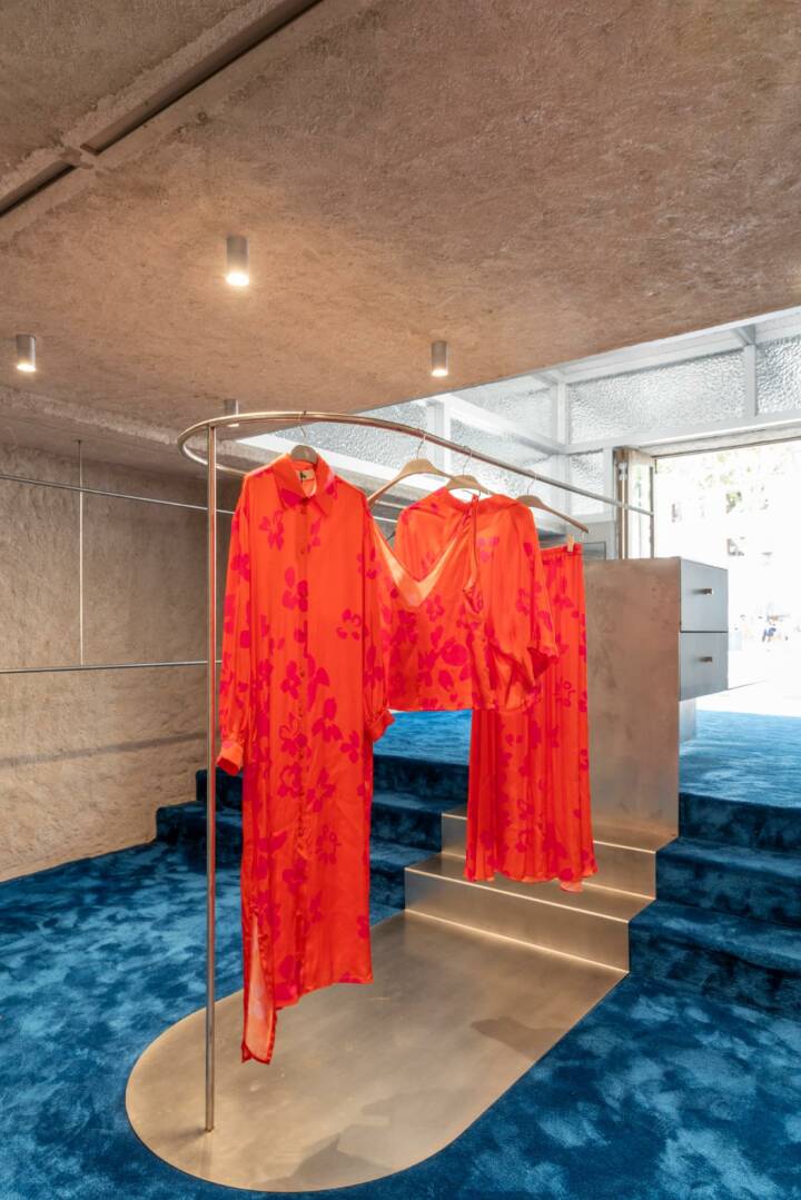
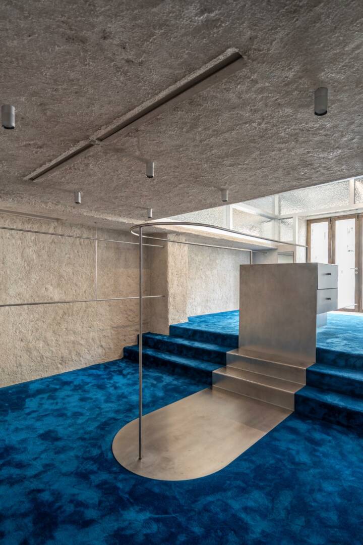
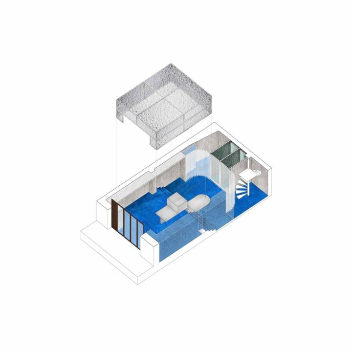
The Polonio is a new clothing brand, closely tied to summer and the beach, that was born a few years ago in Cadaqués, the idyllic village on the Catalan Costa Brava near where Salvador Dalí made his permanent residence. After growing for a few years in Cadaqués, the brand decided to open a new space in Ibiza, in a central pedestrian and commercial area, in a small shop of barely 60 square meters, developed on three levels: a ground floor with an initial double-height area at street level, a rear area three steps below, and a mezzanine accessible by a spiral staircase at the back of the store.
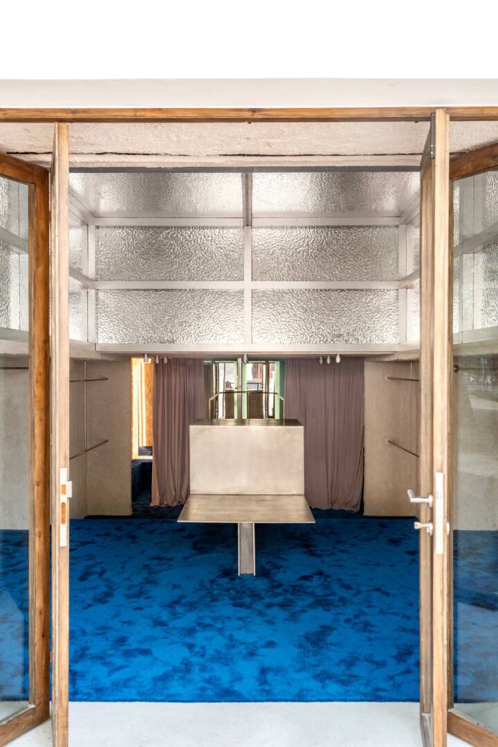
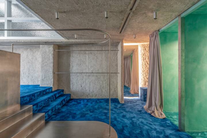
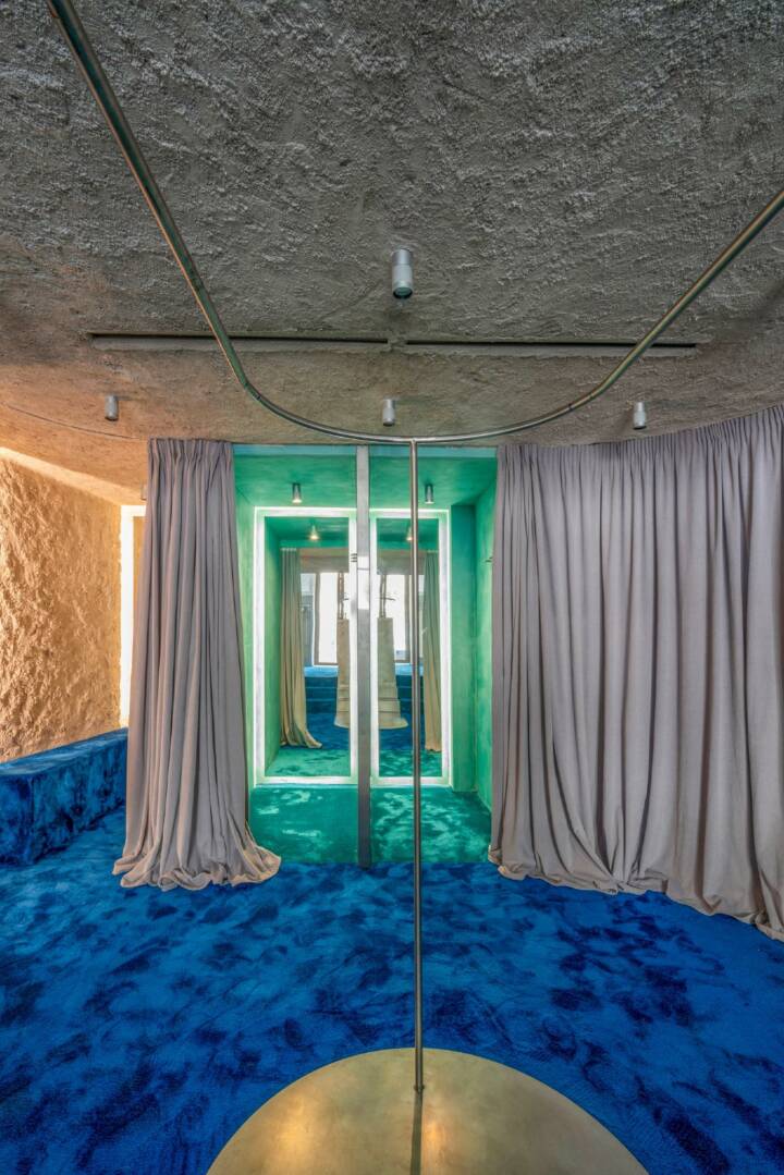
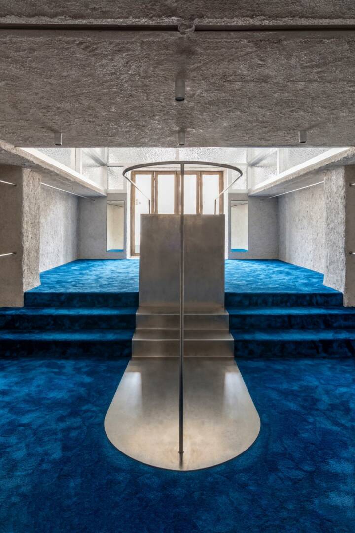
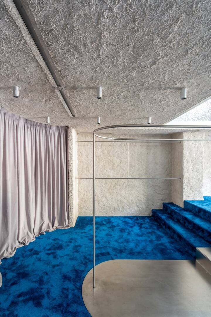
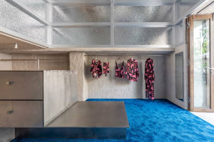
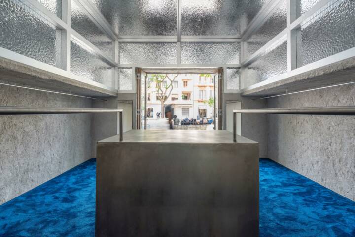
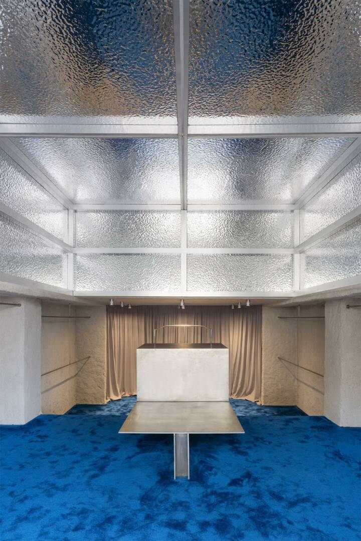
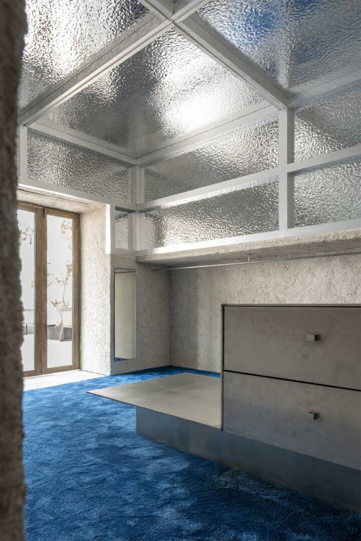
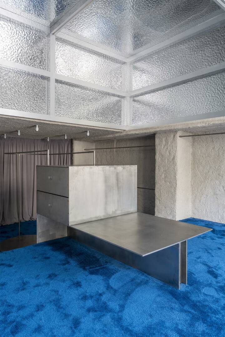
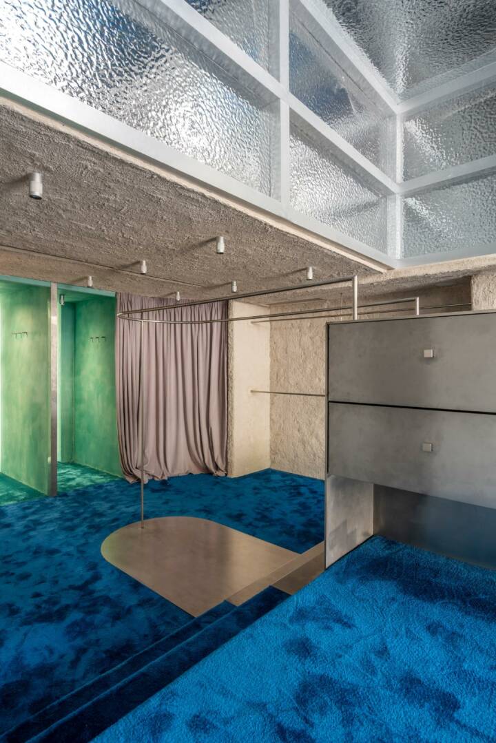
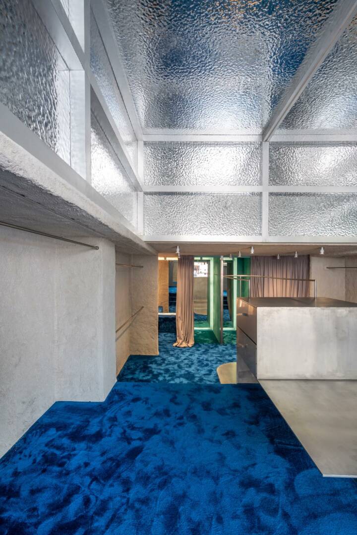
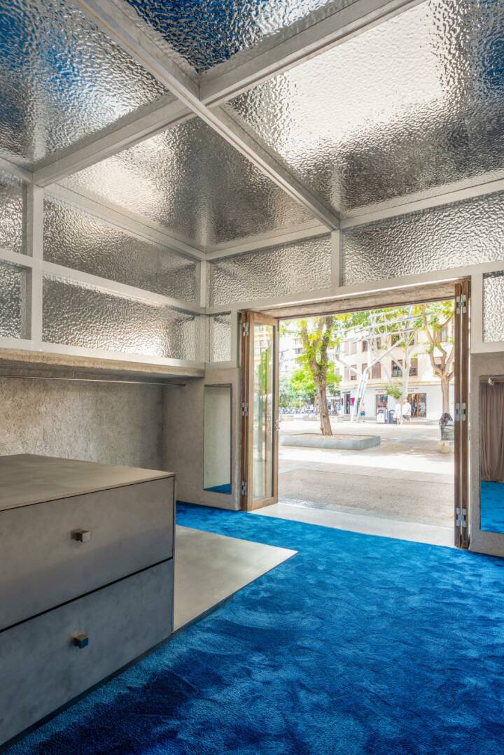
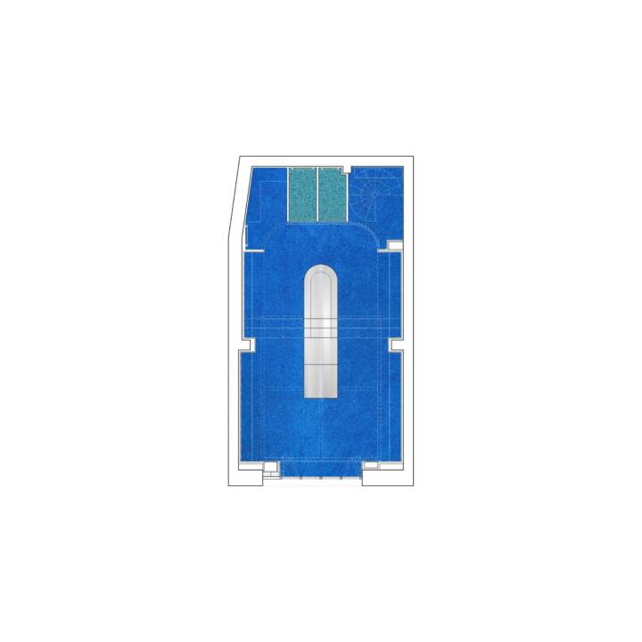
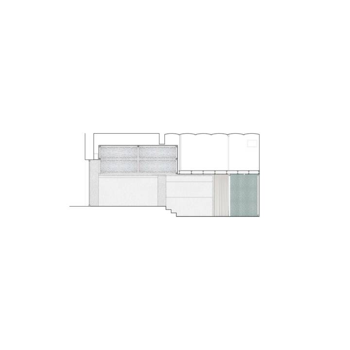
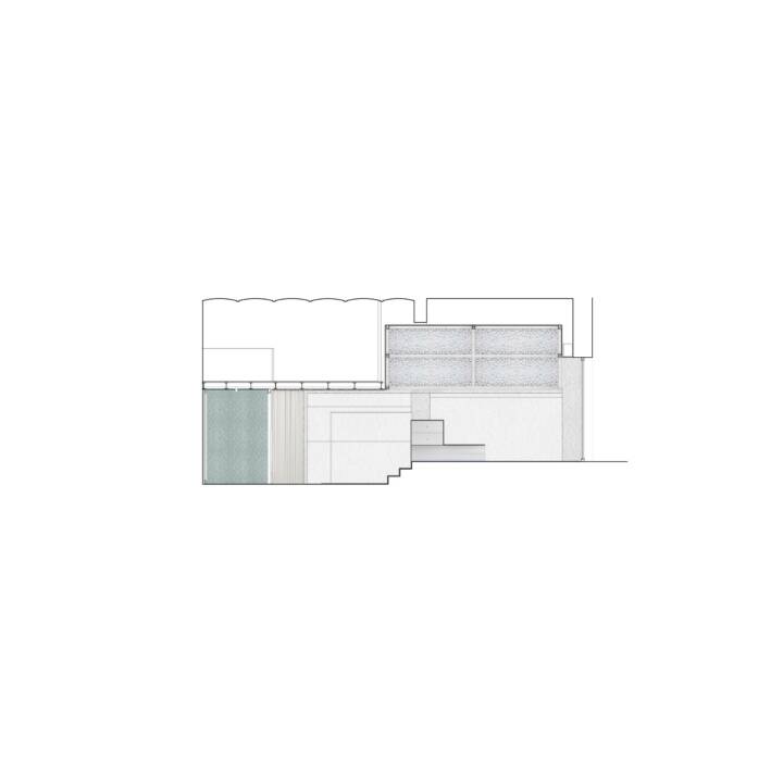
The design emphasizes the strong connection of the brand with Cadaqués, the coast, and summer, creating a spatial abstraction that also solves some functional problems that the space presented. Thus, two longitudinal racks run along the entire perimeter of the store, slipping under the mezzanine (where the storage area is located), connecting through a curtain that draws a curve joining the racks and concealing behind it three fitting rooms. The fact of joining the two levels of the ground floor with these elements solves the expected disconnection between these two areas. In the middle, a sculptural piece of furniture made of stainless steel serves as a counter area and additional racks, creating circulation around it that avoids the typical dead-end of this type of store.
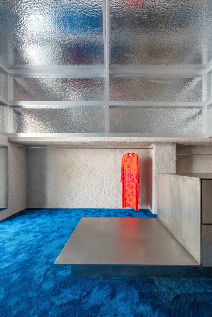
Read MoreCloseThe racks are a ‘dug-out’ construction within the store, coated with sprayed mortar, with an irregular, highly rough finish: they are the rocks; the floor is a continuous blue, long-pile carpet, that draws waves and different shades of blue under the footsteps of customers: it is the water; and above, in the double-height space, some panels with a volumetric finish reflect the blue color of the carpet (the water in motion) and the colors of the clothes: it is the sky.
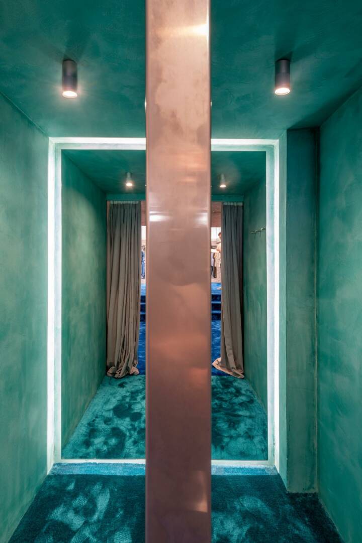
The whole is like putting a small cove from Cadaqués into this space. And the central piece of furniture is something like a fisherman’s boat anchored in the middle. Even the fitting rooms, finished in a stuccoed turquoise paint, with a carpet of the same color, can be seen as caves in the sea, where new colors and textures appear.
These three elements, racks, carpet, and ceiling, actually solve a small but very uneven space, with numerous pillars, lowered beams, or irregularities, thus creating a space with a very marked and regular geometry, arranged along a symmetry axis with the entrance.
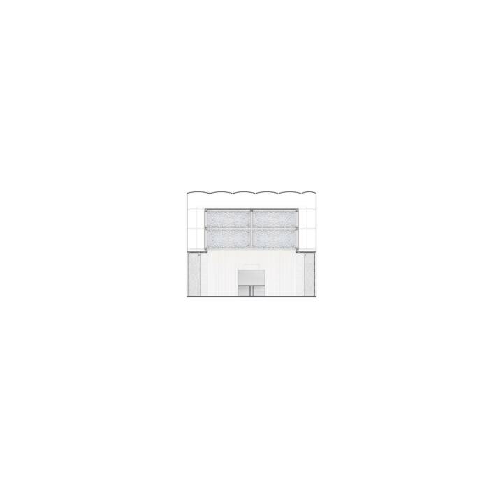
Finally, the solution of the double-height metallic ceiling, with frames drawing a grid on all its faces, is a direct reference and homage to the American Bar by Adolf Loos, a masterpiece of interior design.
Text provided by the architect.
