Architects: Sverre Fehn Photography: Åke E:son Lindman Construction Period: Location: Venice, Italy
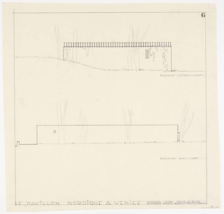
Three were originally invited to draw up plans for a ‘Nordic’ pavilion: the Finnish partnership Reima and Raili Pietilä, Sverre Fehn from Norway, and the Swede, Klas Anshelm. Following the selection of Fehn’s proposal in 1959, Gotthard Johansson wrote in the Svenska Dagbladet of the project’s “stunning simplicity […], without too many architectural overtones”[1] – a proposal for a space able to unite a triumvirate of nations under one (exceptional) roof.
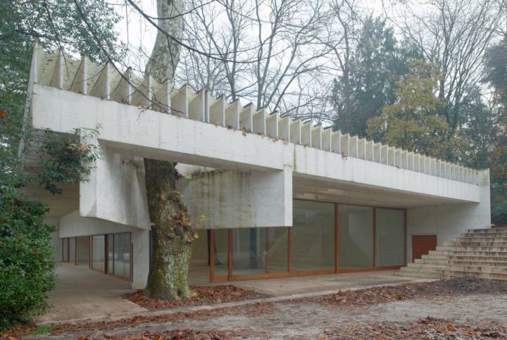
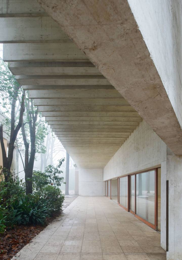
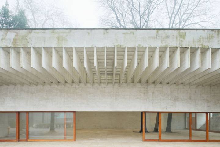
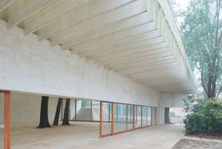
Read MoreCloseOver five decades later the ‘Nordic Pavilion’ (as it would only later become known) has come to reflect, consolidate and embody Nordic architectural traditions. Look a little deeper, however, and it becomes clear that Fehn actually sought to invert them entirely. In place of heavy timber beams Fehn chose slender concrete lamellae, pigmented to glow (reflecting, for one common metaphor, sunlight falling on a quilt of snow). Rather than create a closed space to shut the elements out—a typical vernacular in Norway—he completely removed two of the building’s four boundary walls. In designing the roof to be essentially open to the skies, Fehn was able to specifically control how the rain would fall into the space. In this sense, it is a building in possession of its surroundings – accepting its direct context while tentatively suggesting another, distant world.
Fehn did not seek to mimic a Nordic vernacular – the Pavilion is not an act of mimesis in the conventional sense. He sought to rewrite (as opposed to translate) something hitherto indescribable: the sense of a ‘Nordic’ architecture for the Venetian climate and situated in the uninhabited, uniquely fragmented context of the giardini of la Biennale di Venezia. Just as Walter Benjamin described the act of translation as a “mode” rather than an act,[2] Fehn recognised that the orchestration of space by assemblage is different to that of contextually grafting—and thereby crafting from, and into—a new environment.[3]
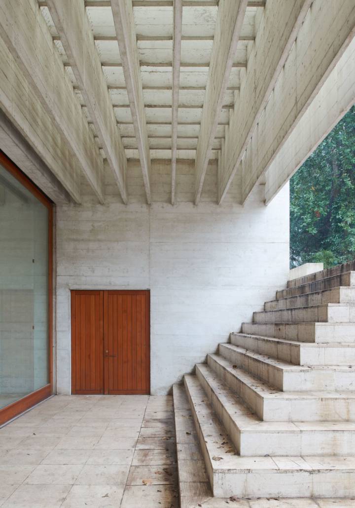
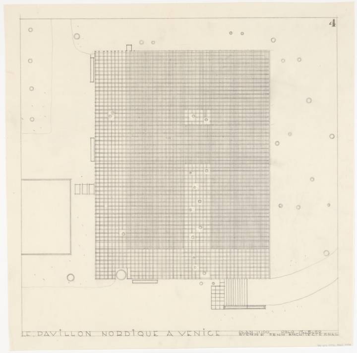
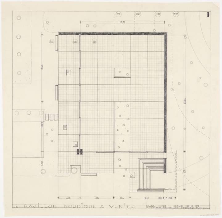
Distilling Fehn’s architectural moves into a collection of articulated elements—roof, ground, wall, stair and beam—belies its complexity as a consolidated spatial gesture. Just as the Palazzo Ducale (a ten minute journey away by water) should only be read as one part of a “metamorphosis” (in the words of Giulia Foscari[4]) between surface, object and space that comprise Piazza (and, by extension, Piazzetta) San Marco, the Nordic Pavilion is more than an assemblage of parts. It is the culmination of an orchestration of spatial ideas and atmospheric intentions between wall, ground, step, ‘roof’, landscape, light, and ‘interstitiality’ – all framed by its relationship to the topography of the site.
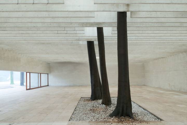
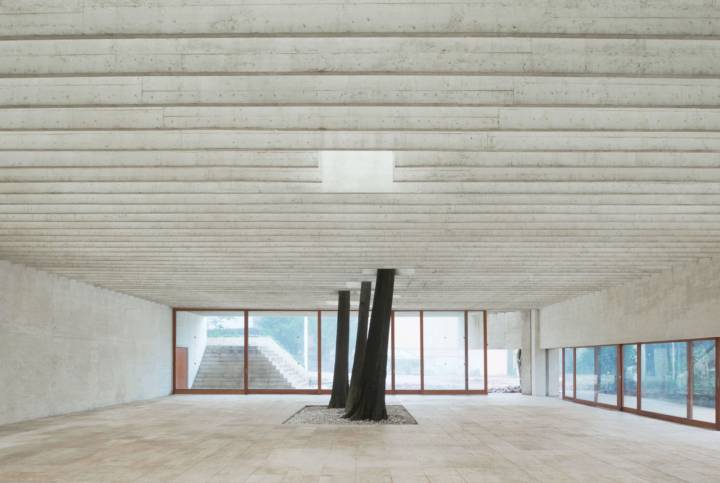
The grid, which might otherwise appear monotonous in its rigidity, is interrupted by a series of openings through which the three remaining internal plane trees[5]—of which there were originally seven—erupt from the ground to punctuate vertically through, up and out of the space.
During his travels through Italy which followed, Fehn became acutely aware of the different characteristics which light can take. Upon his return to Norway he was “able to recognize the distinct nature of Nordic light” like never before.[7]
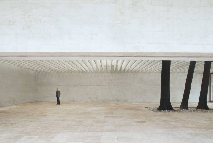
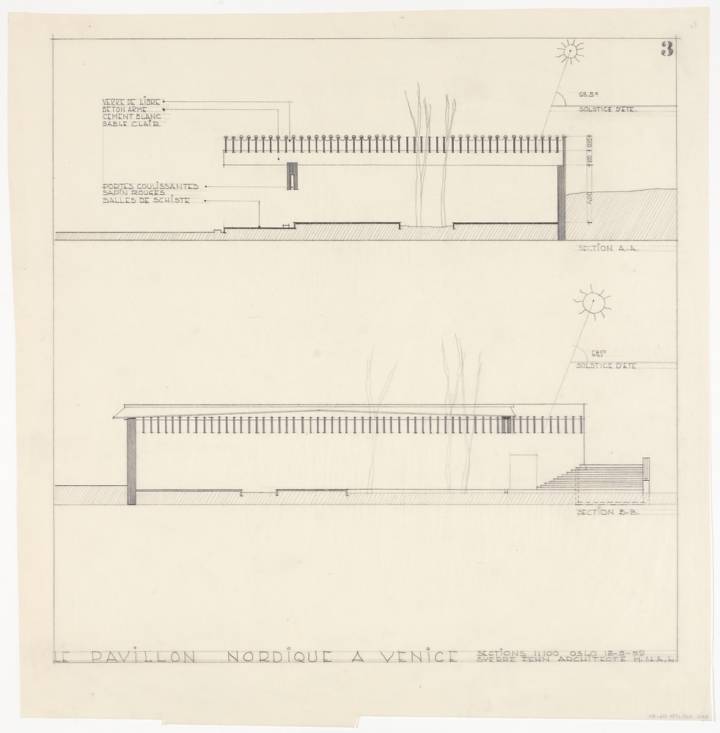
Like any translator worth their salt, Fehn employed both original materials and those specific to the site—a concrete combination of white cement, white sand, and crushed white Italian marble—to sculpt a quality of light of incredible intensity, tranquility and, most importantly, steady homogeneity. He wanted to do nothing more than “construct a roof to protect the paintings and sculptures”—for the building’s first intended function was as a gallery—“from direct sunlight.”[8]
For the ‘roof,’ which would more accurately be described as a collection of light wells, Fehn designed two layers of concrete brise-soleil. These lamellae, each precisely one-metre tall and six-centimetres thin, blanket the internal space to create a plane of two-metre deep pockets set, by their width and height, at a ratio of 1:2. They stretch across the room in a single span, bracketing one another in intervals of 52.3 centimetres. Together they distil the heady, warm Mediterranean light into its ‘Nordic’ variation: at once shadeless, uniform and bright. It is a light that is “definite, but familiar”[9] and, in the words of Marco Mulazzani, provides a constant, homogenous sense of illumination.[10] In other words, a shadowless world.
[1] Marco Mullazzani, Guide to the Pavilions of the Venice Biennale since 1887 (Milan: Electa, 2014), pp.122-126[2] Walter Benjamin, Harry Zorn trans., The Task of the Translator in Illuminations (London: Pimlico, 1999), pp.70-71
[3] In other words, just because wood, brick, mortar and concrete can be found or fabricated almost anywhere, does not mean that they should be used in the same way everywhere.
[4] Guilia Foscari, Elements of Venice (Zürich: Lars Müller, 2014), pp.12-27
[5] According to Ole Gaudernack the three remaining trees within the pavilion are Celtis Australis, also known as the Mediterranean hackberry, the European Nettle Tree, or the Honeyberry).
[6] Richard Kearney, On Stories (London: Routledge, 2002) p.140 (via Neveu, On Stories: Architecture and Identity)
[7] Mark J. Neveu, On Stories: Architecture and Identity (Oslo: Arkitektur N, 02, 2008), accessed February 28, 2016, p.5
[8] Christian Norberg Schulz, Gennaro Postiglione, ed. Sverre Fehn: Samlede Arbeider, (Oslo: Orfeus Forlag, 1997) p.248 (via Neveu, On Stories: Architecture and Identity)
[9] Neveu, On Stories: Architecture and Identity
[10] Marco Mullazzani, Guide to the Pavilions of the Venice Biennale since 1887 (Milan: Electa, 2014), p.19
Description by Archdaily.
