Architects: Nial McLaughlin Photography: Nick Kane Construction Period: 2021 Location: Cambridge, United Kingdom
We were appointed to design Magdalene College’s New College Library through a competition held in 2014. The new building replaces cramped and poorly equipped facilities in the adjacent Grade 1 Listed Pepys Building with a larger library, incorporating an archive facility and a picture gallery.
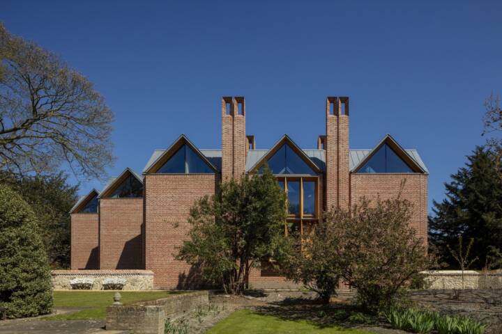
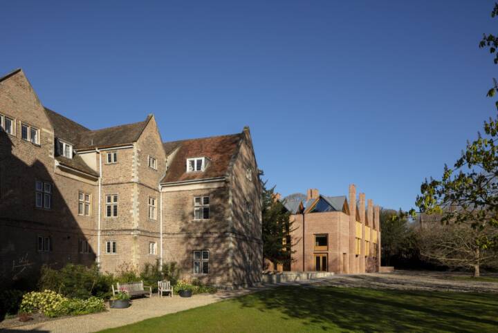
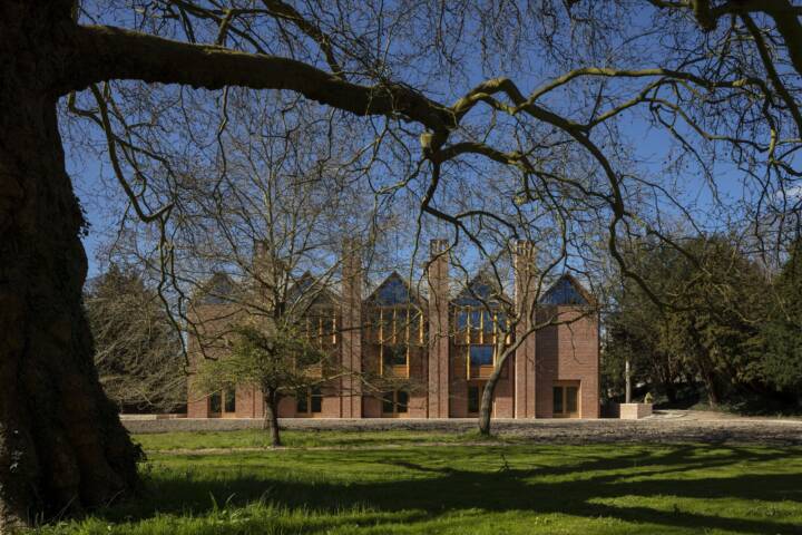
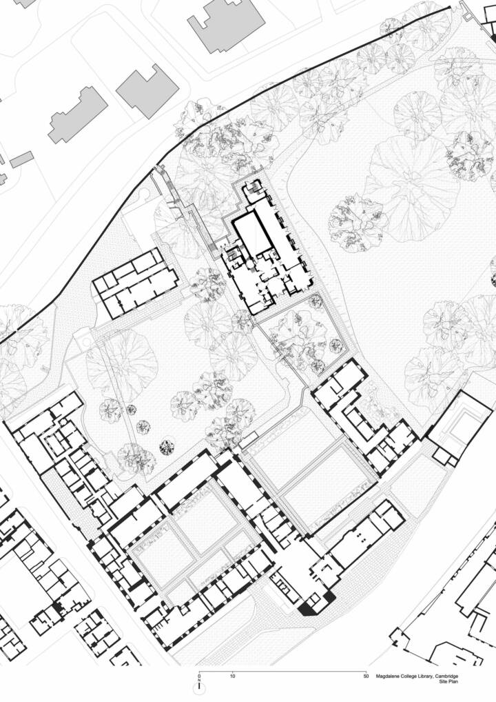
The new building is sited in a highly sensitive historic setting, along the boundary wall between the enclosed space of the Master’s Garden and the more open space of the Fellows’ Garden. Its placement extends the quadrangular arrangement of buildings and courts that developed from the monastic origins of the college site.
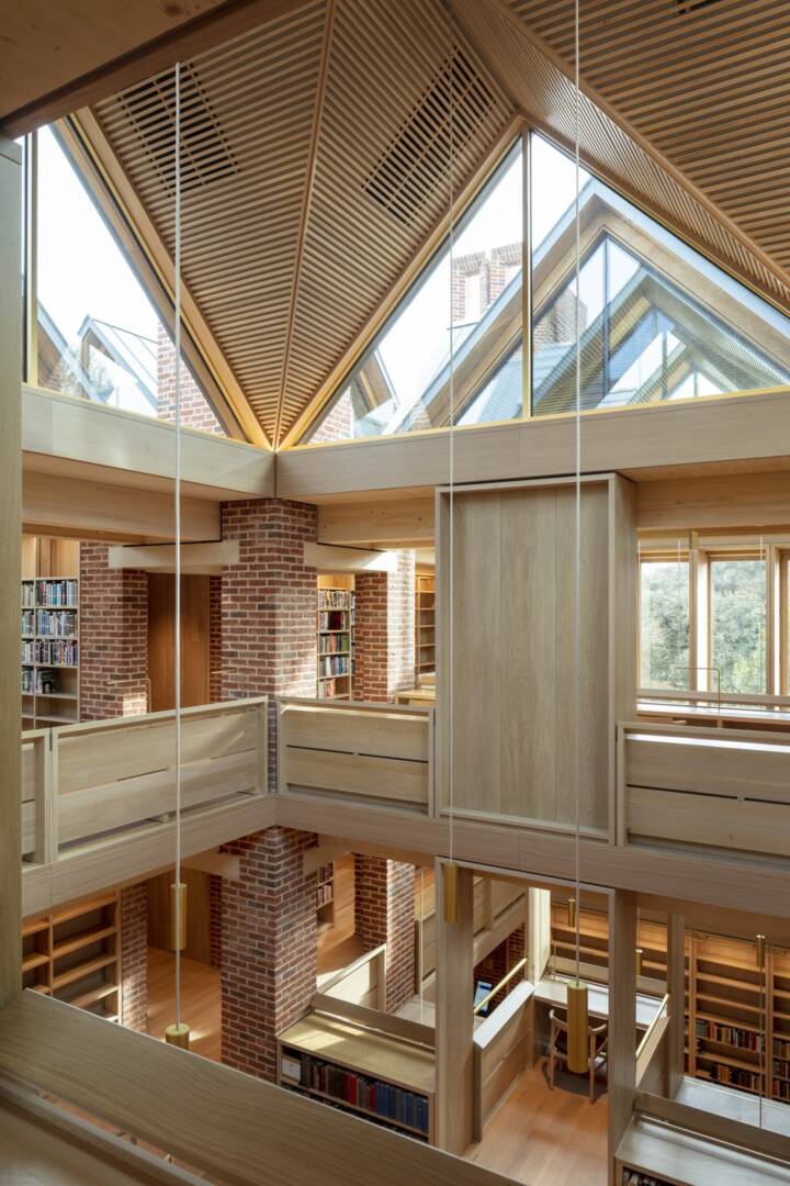
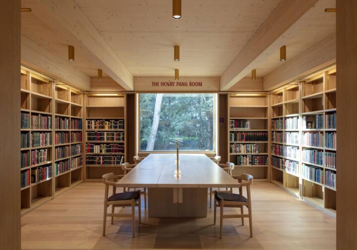
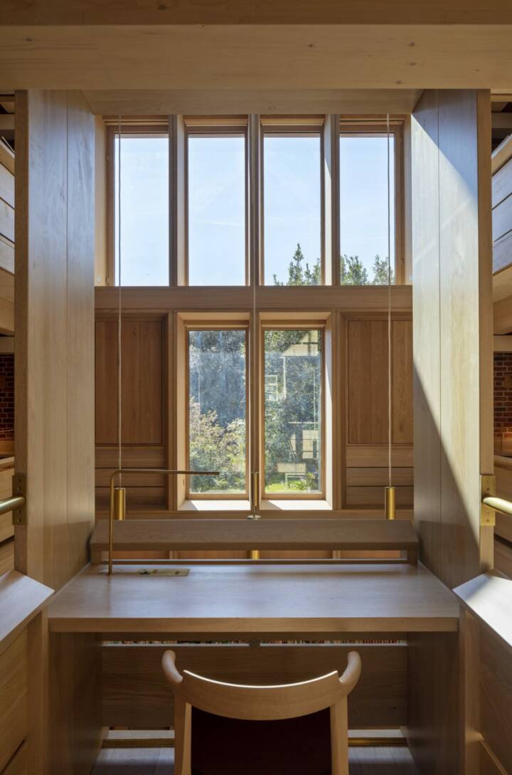
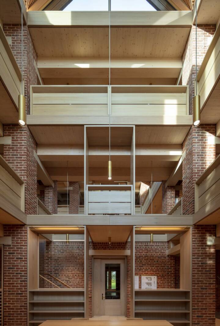
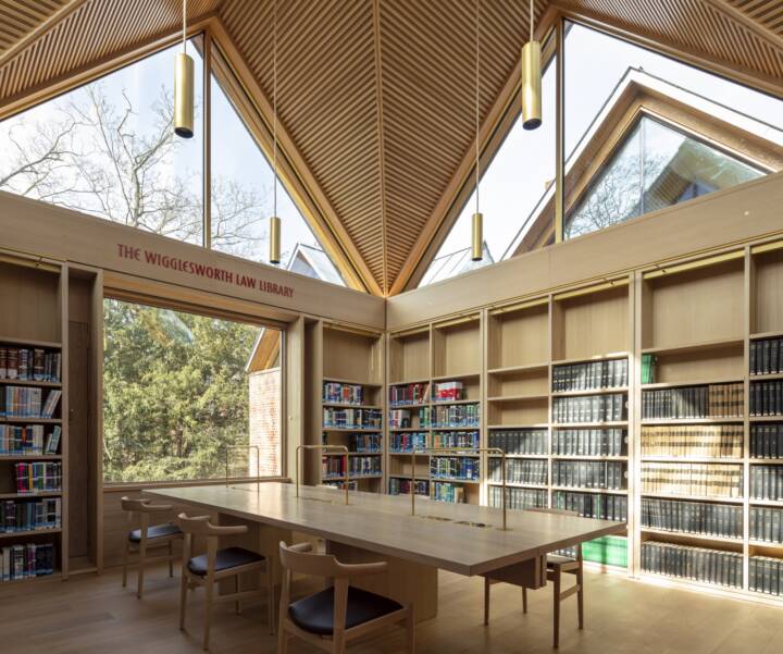
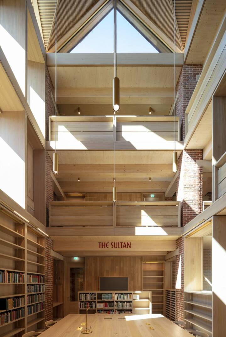
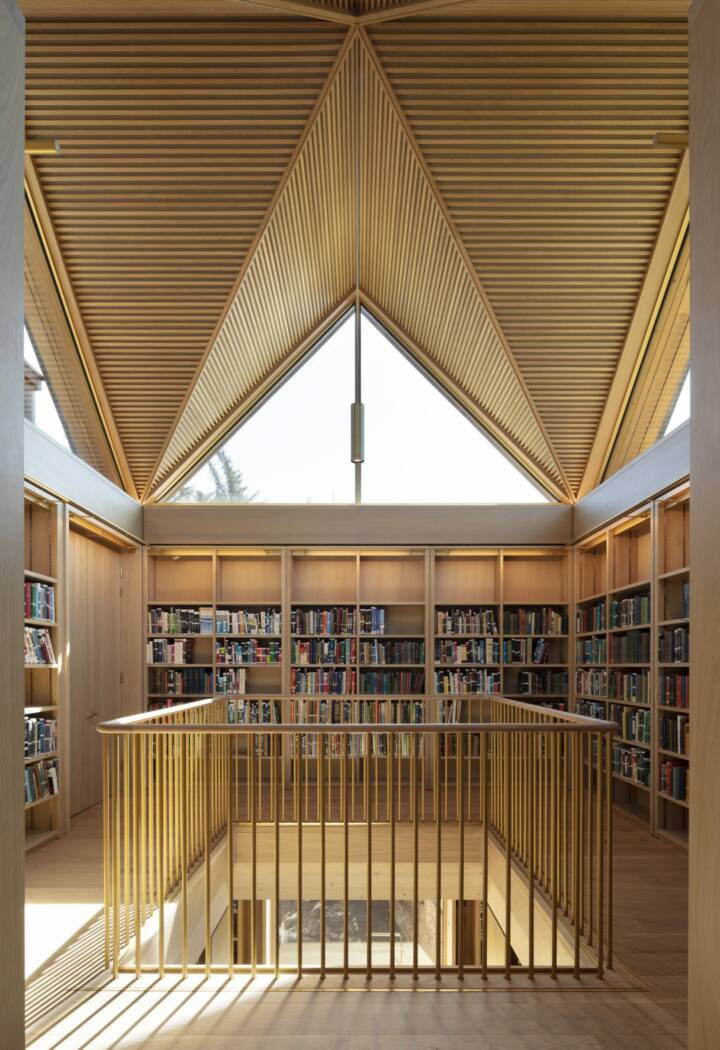
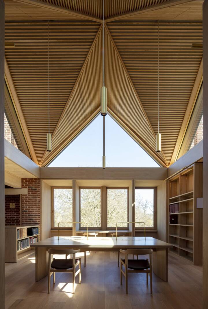
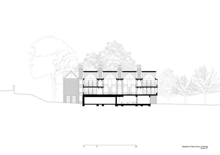
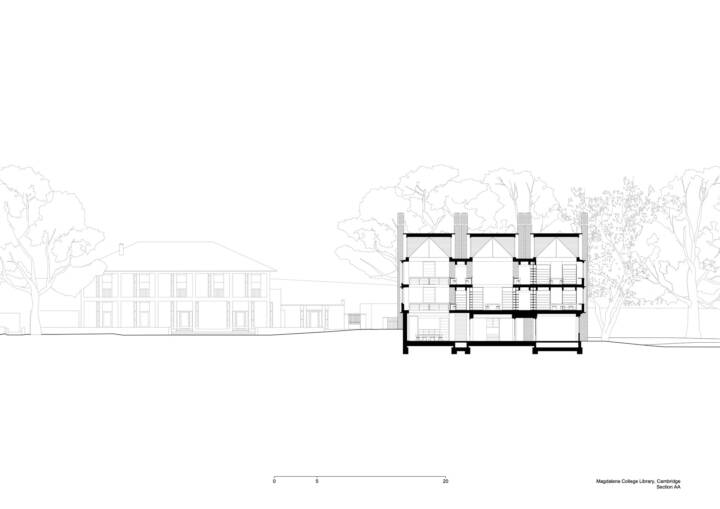
The library is approached from Second Court, through a little doorway, and out under an old Yew tree. From this shady corner, you sense the presence of the river opening out at the edge of the lawn. We wanted to make the building a journey that gradually rose up towards the light. On the way up there would be rooms, galleries, and places to perch with a book. At the top, there would be views out over the lawn towards the water. We wanted to create a variety of ways for someone to situate themselves depending on inclination. You might sit in a grand hall, a small room, or tuck yourself into a tiny private niche.
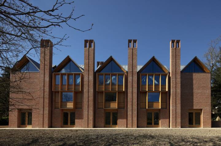
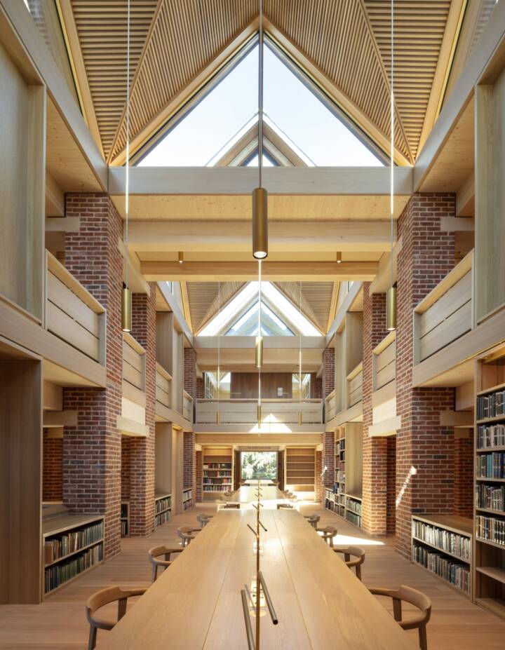
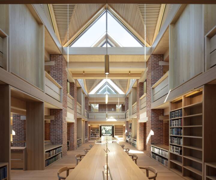
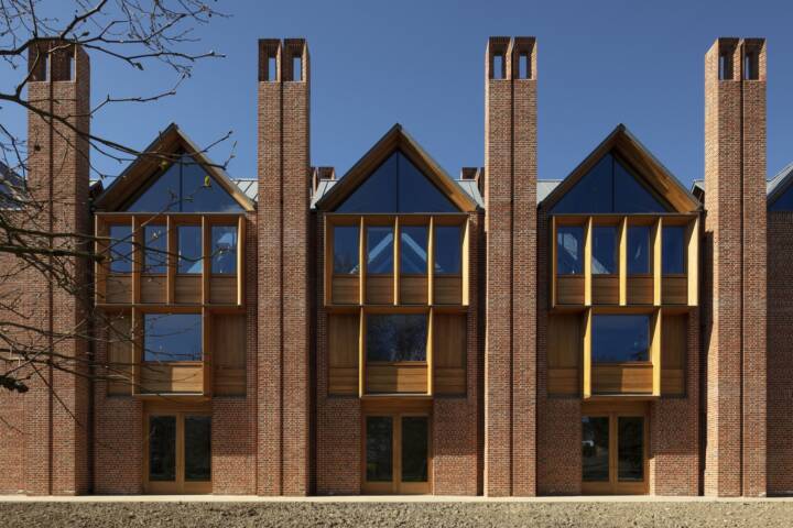
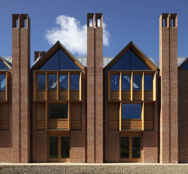
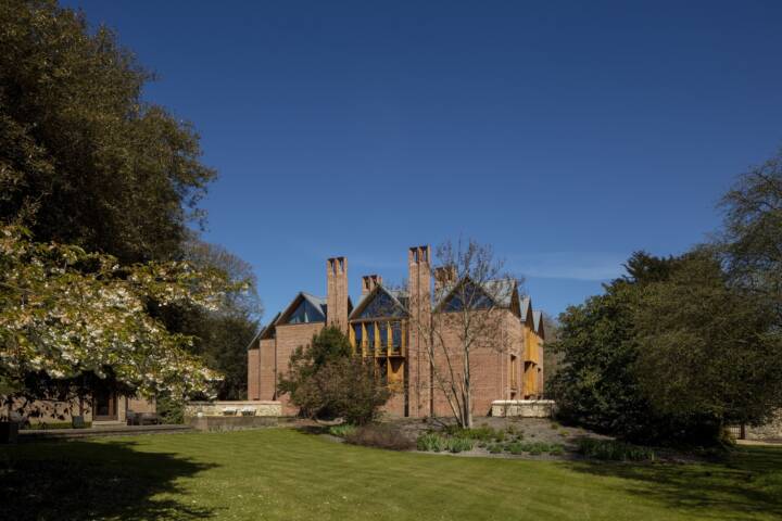
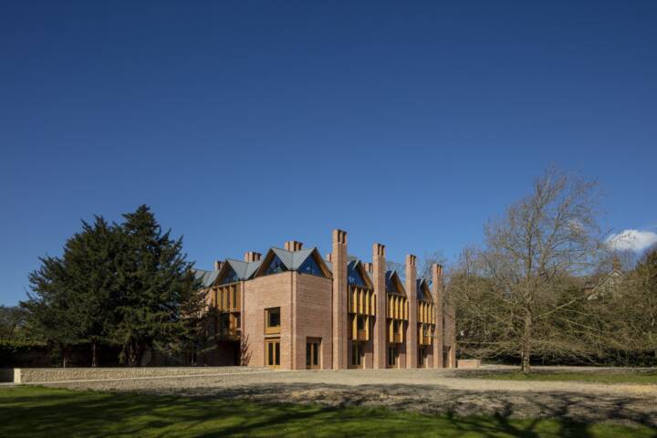
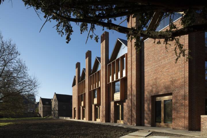
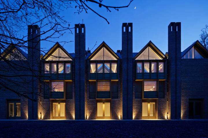
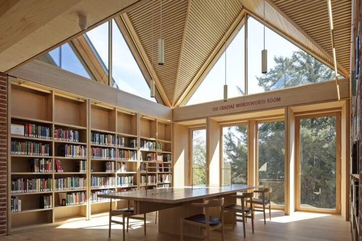
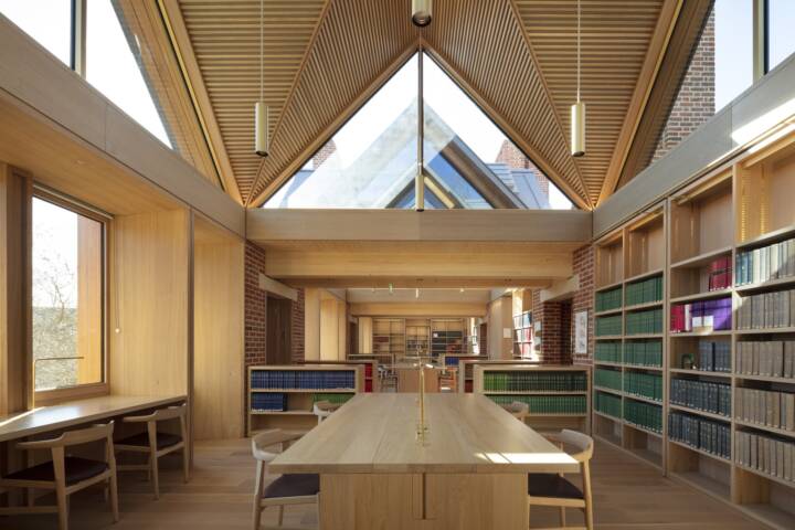
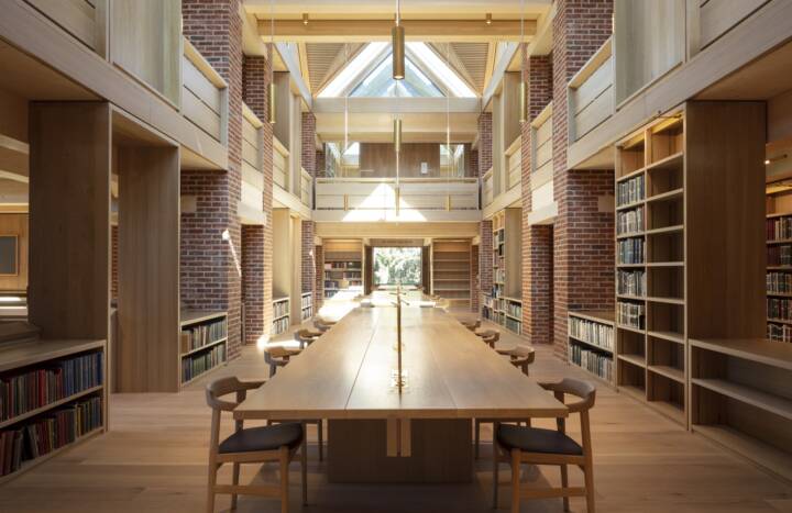
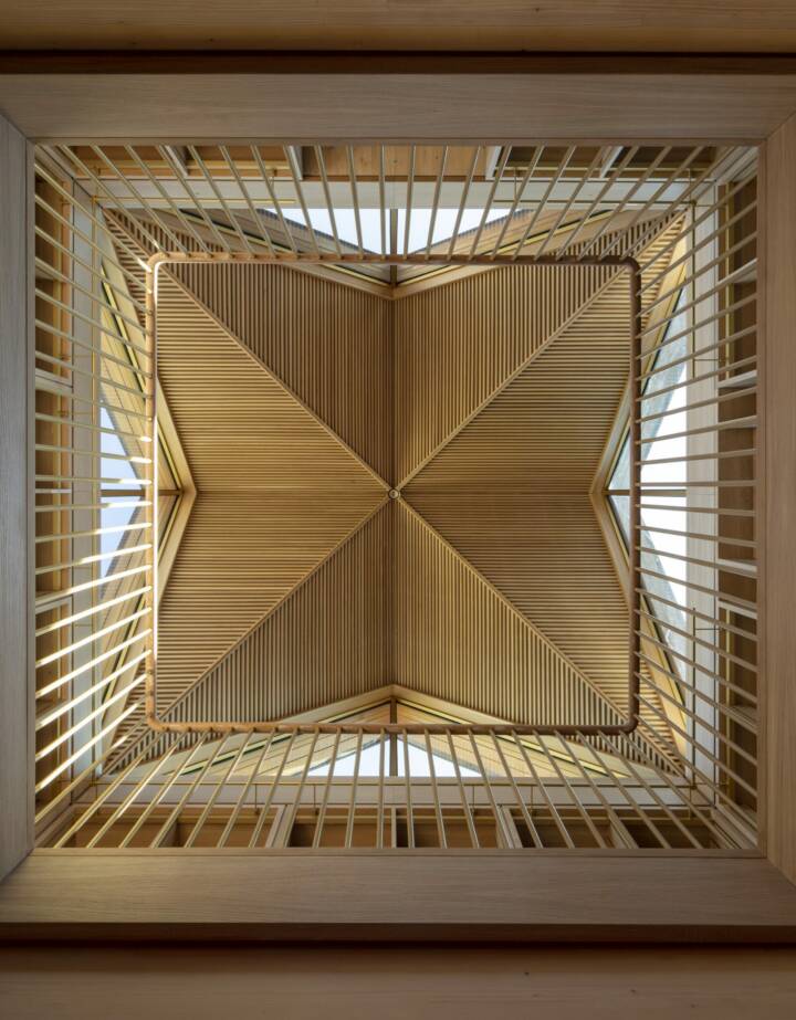
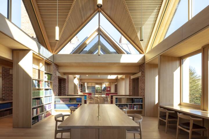
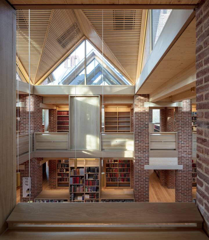
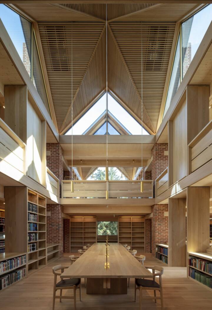
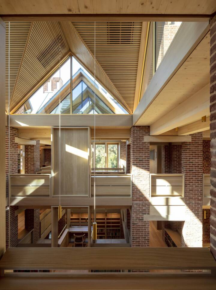
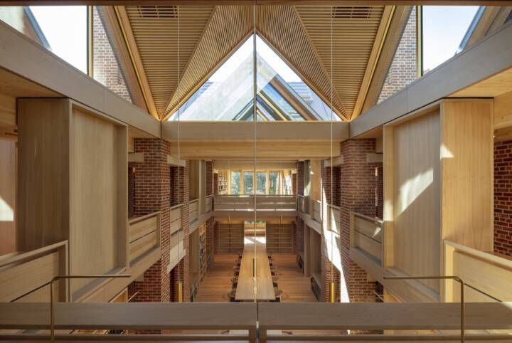
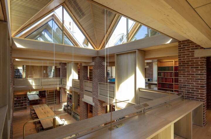
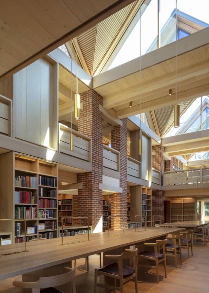
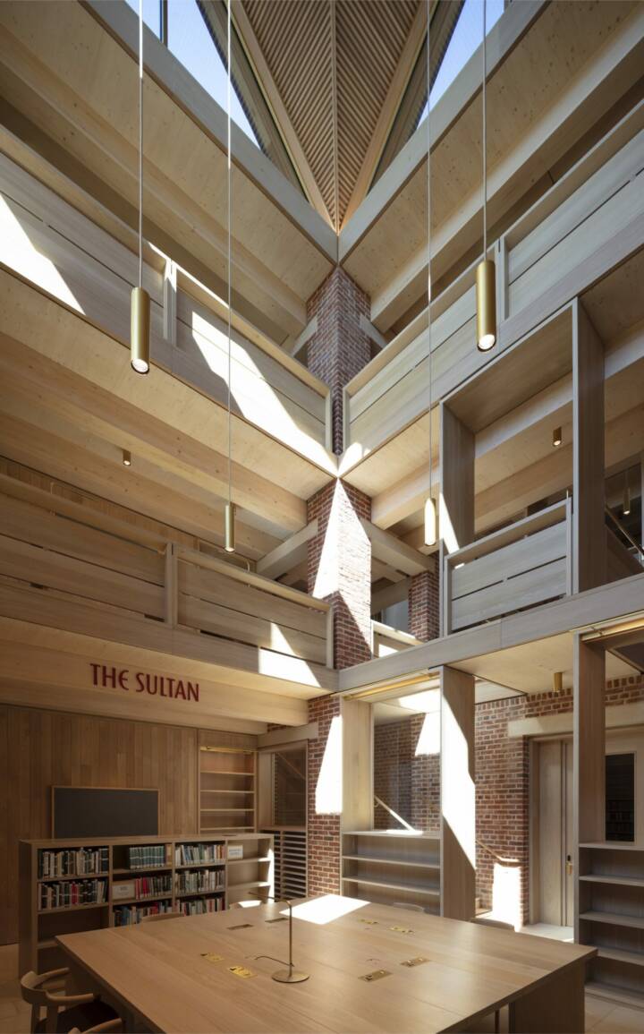
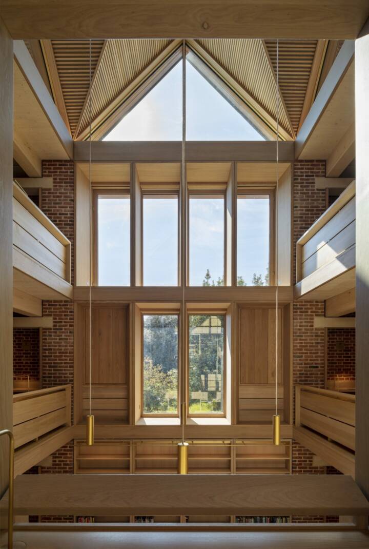
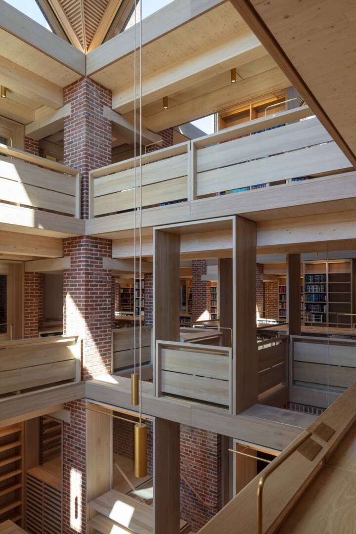
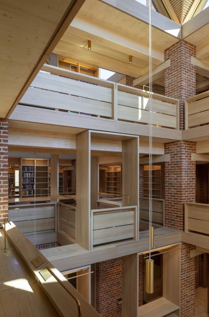
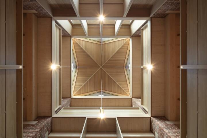
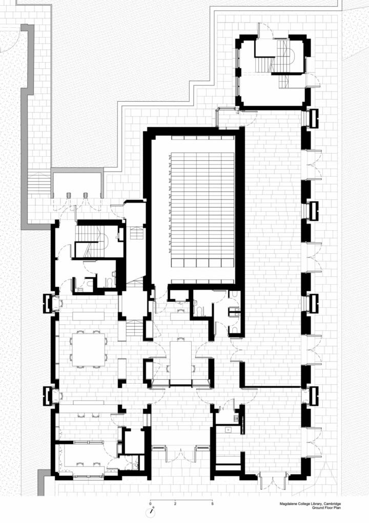
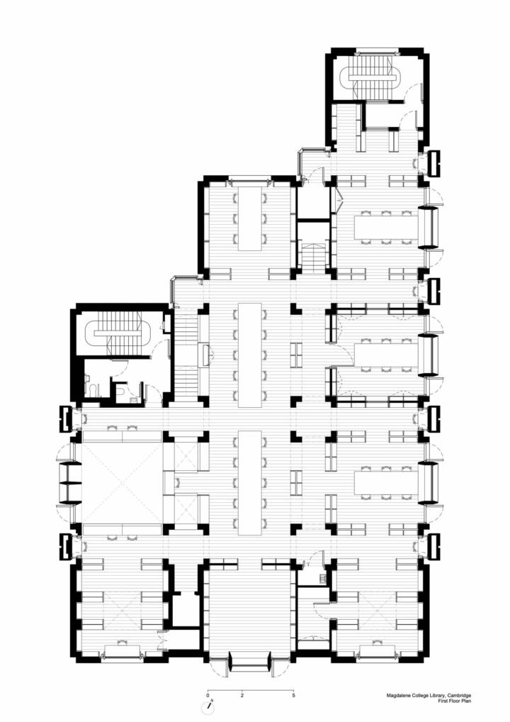
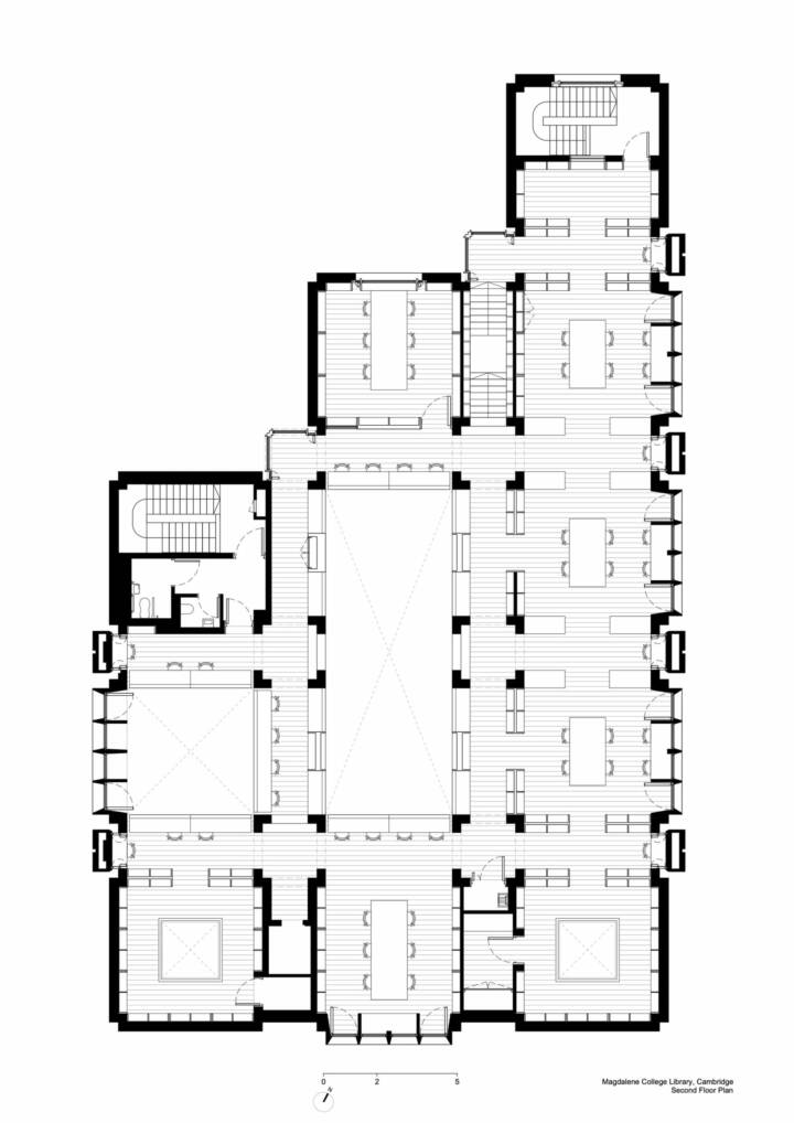
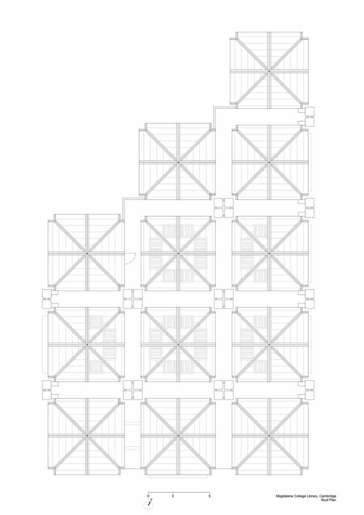
Read MoreCloseFor us, good architecture plays a variety of experiences against underlying order so as to produce harmony. The new library is based upon a logical latticework of interrelated elements. A regular grid of brick chimneys supports the floors and book stacks and carries warm air up to ventilate the building. Between each set of four chimneys, there is a roof lantern bringing light down into the spaces below: air rising and light falling.
This regular array produces a natural hierarchy with narrow zones for circulation and wide zones for reading rooms. The delineation of load-bearing brick vertical structure, supporting spanning engineered timber horizontal structure is used to reinforce the organizational scheme. This creates an underlying pattern of warp and weft that we hope can be understood intuitively by people using the building.
The materiality and form of the new library are derived both from its context and from the College’s brief to make a highly durable and sustainable building. The older college buildings are of load-bearing brick, with timber floors and gabled pitched roof structures. Brick chimneys animate the skyline and stone tracery picks out the fenestration. We tried to make the new building from this set of architectural elements. We used timber instead of stone for our window tracery, which will weather over time to become a silvery grey like the stone.
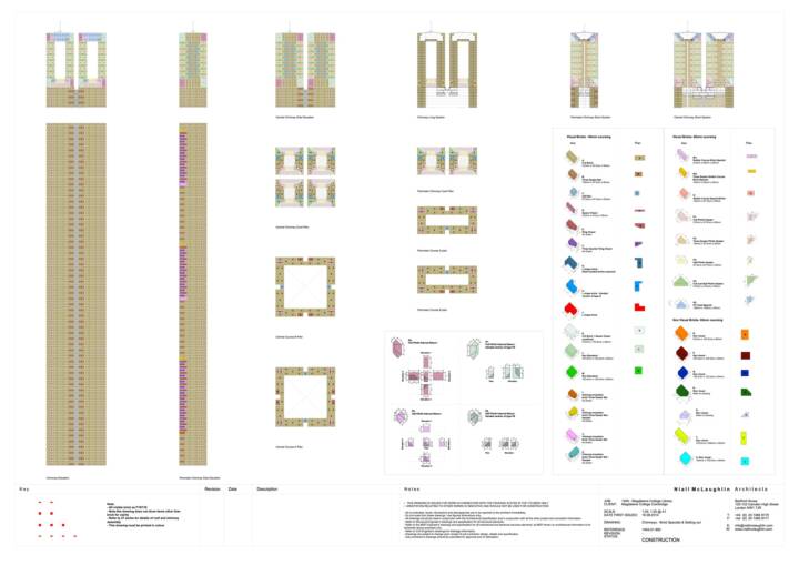
We worked carefully with our builders to find a variety of bricks that would match the tapestry-like quality of the older College buildings. At the same time, this is a modern building that employs innovative passive ventilation strategies to minimize energy in use and engineered timber structure to reduce carbon embodied in its construction.
Text provided by the architect.
