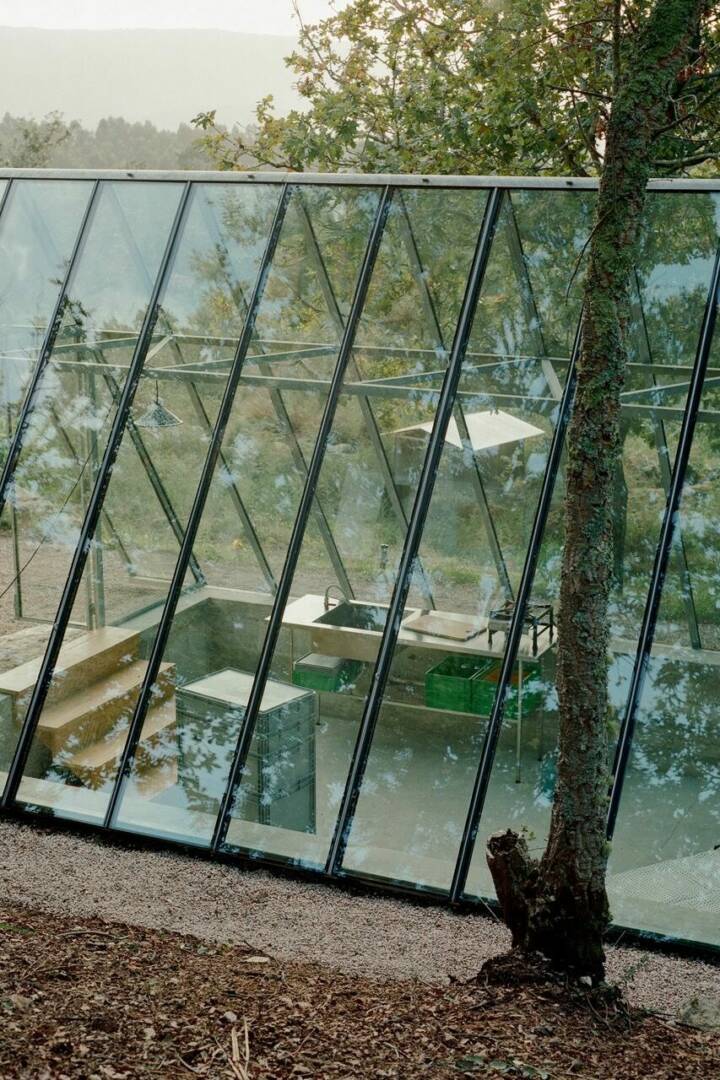
Architects: Glenn Murcutt Photography: Reiner Blunck Construction Period: 1992 Location: Kempsey, Australia
I had kept the building as I thought that one day I might restore it, making planning changes. It was a rural worker’s flat and tractor shed, located to the south and below the main house. At Christmas, this shed was the local dance hall. Some of the floor was propped in the 1930s and 40s. The old flooring boards are thick and oversized, with oil stains all over them. The shell was in a deteriorated condition.
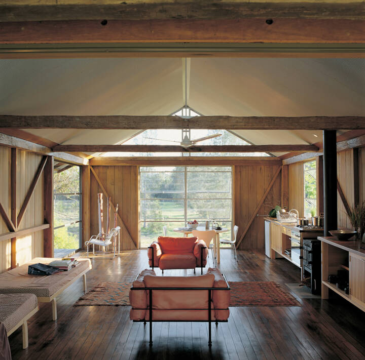
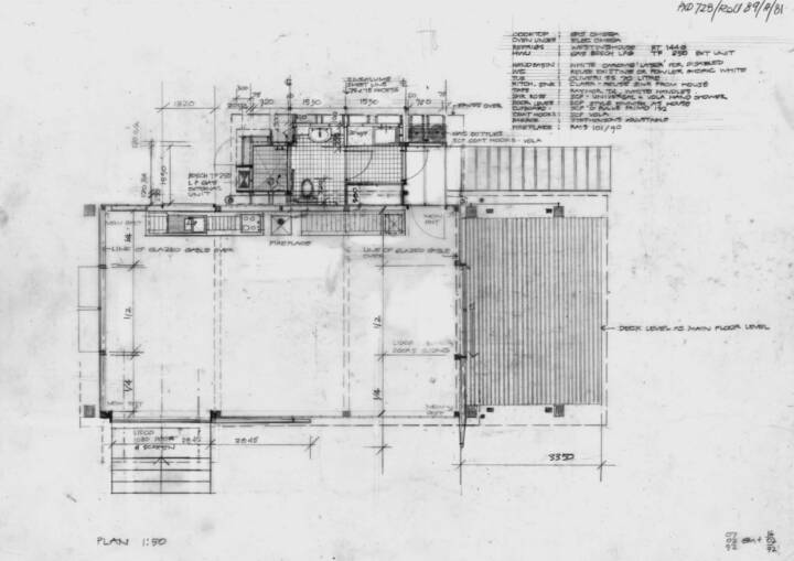
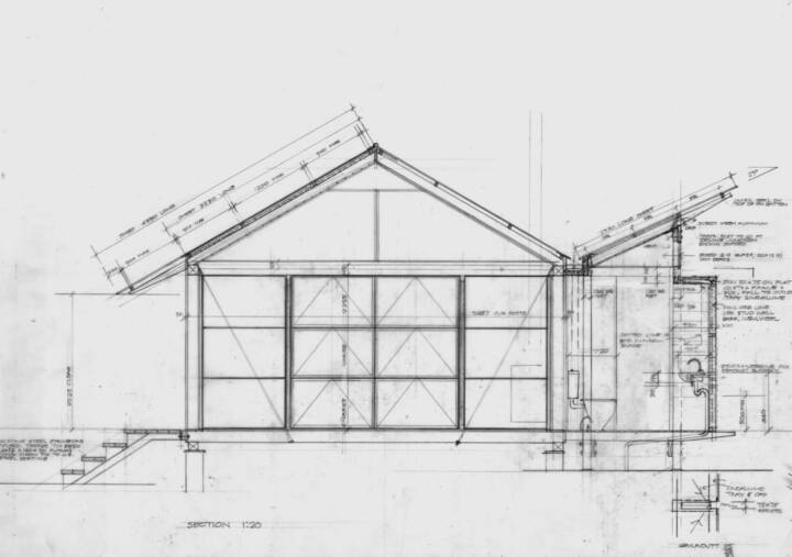
The biggest aesthetic problem was spatially dealing with the timber bottom cords to the exposed roof trusses The bottom cords defined spaces. To have them fall above beds or in the centre of a zone would make for very awkward occupation. Taking these bottom cords as givens, I organised the plan into three zones, with the fireplace in the middle zone.
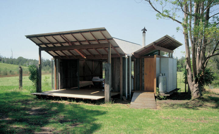
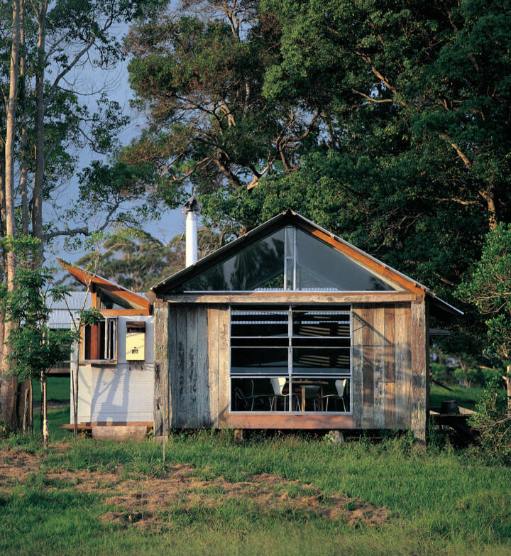
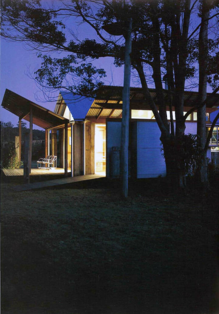
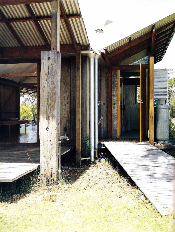
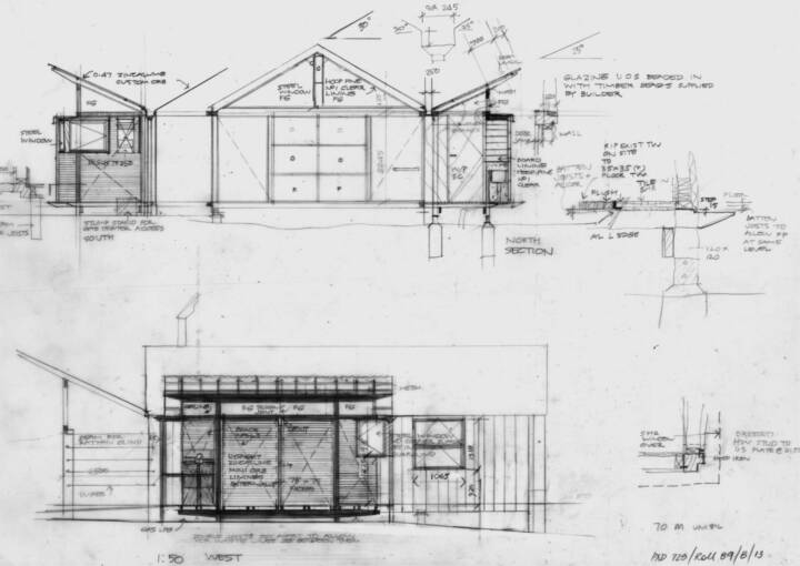
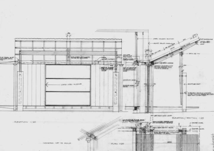
I very much enjoyed taking an existing seat-of-the-pants farm shed, reusing materials and restoring and reworking some elements. And it is still a shed, but now very comfortable. All the material is reused from the shed or recycled from a pergola that was pulled down from the house. Inside, the original timber boards forming the walls have been sanded. A hoop iron strap tongue between each board allows for the movement of timber and prevents insects entering. I renewed the roof. The roof framing is renewed in part, where the termites had inflicted damage. I retained the hand-shaped adzed timbers. The building can ventilate at each end at the ridge glazing.
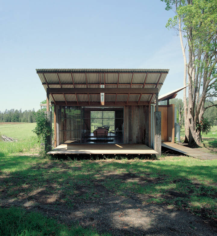
Read MoreCloseSome posts were termite-damaged. New posts were bolt connected to the solid sections of the posts. New posts extended the existing posts and set up the skillion so that sun from the north penetrates deeply into the room in winter. The new posts taper back at the base.
The finesse in the kitchen and rawness of the other parts is a good contrast. The floor, with its different oil stains, has a beautiful sheen through the waxed finish. The window system is standard steel.
The small shower room and toilet are lined externally in Miniorb. The shower space works well. There is no corner mullion, and when the adjacent windows are open, the corner dissolves. With the windows open, you feel at one with the landscape.
I wanted to create as much space as possible and visually relate to the house and the landscape. For me there is an appeal in the minimalism which provides for the essence of living, using an existing shed with a clip-on shower room and toilet. It’s just one room, simple.
Text provided by the architect.
