Architects: Jordi Herrero Arquitectos Photography: José Hevia Construction Period: 2024 Location: Palma de Mallorca, Spain
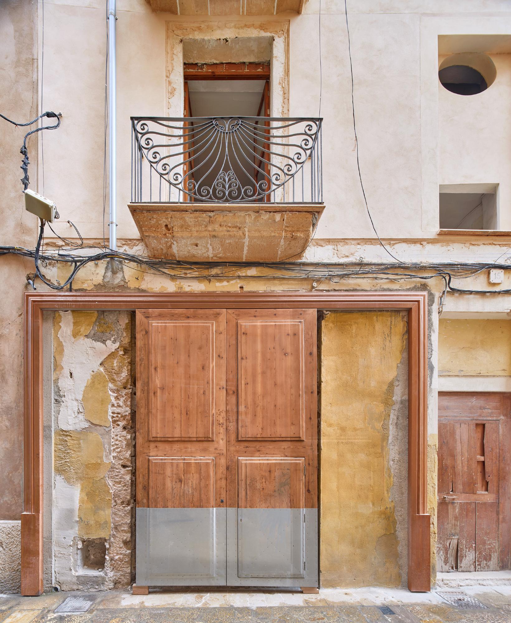
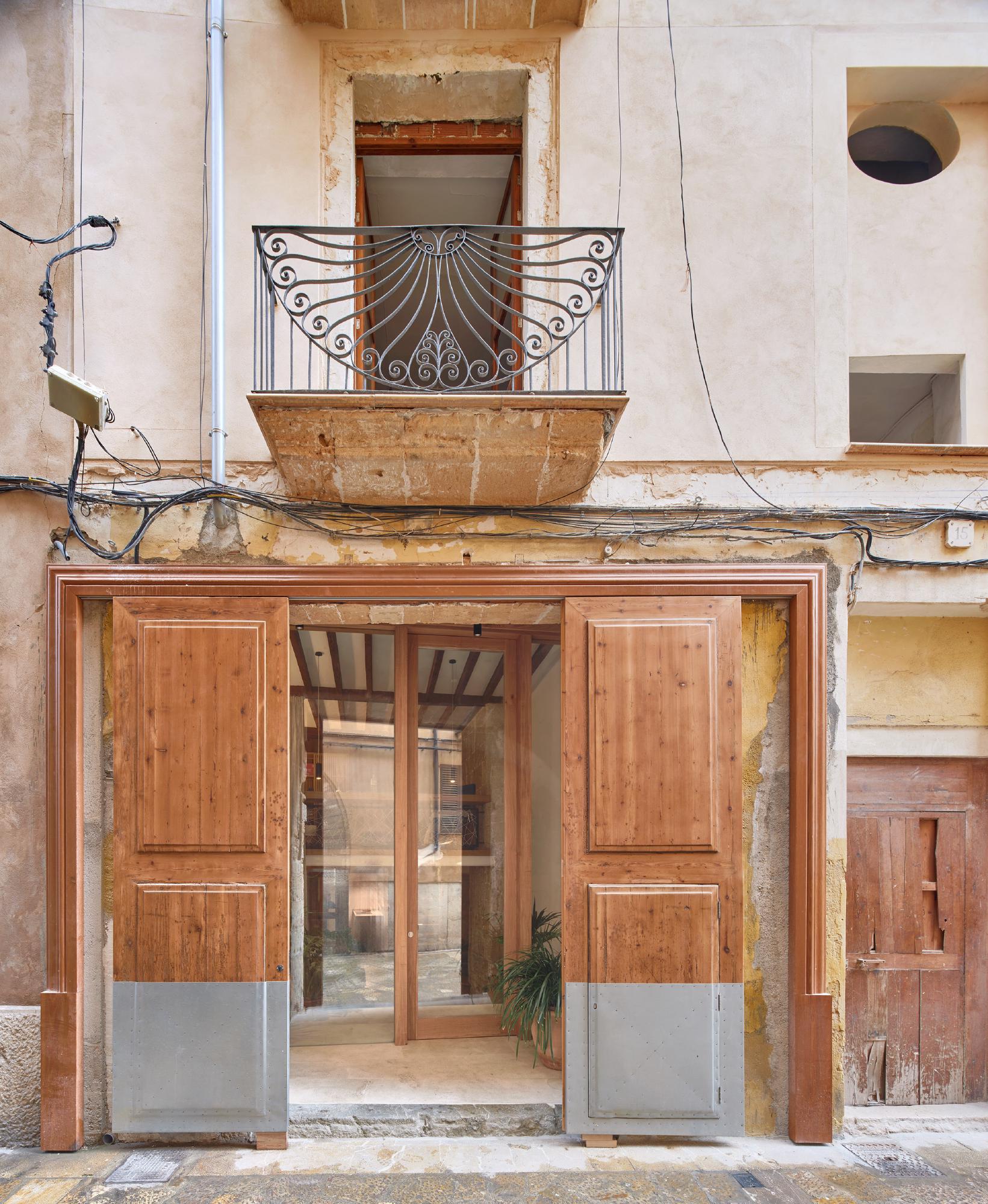
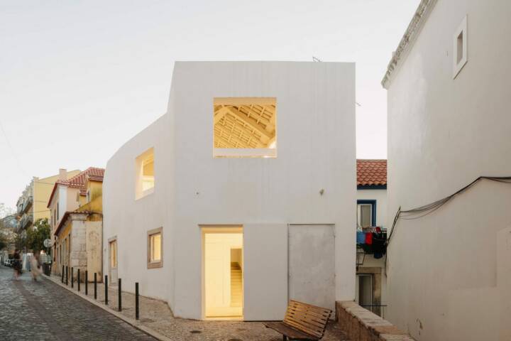
This project involved the renovation of an old ground-floor store into a residential space for friends. Located in the heart of Palma de Mallorca’s historic center, the property sits directly opposite the Montisión Church.
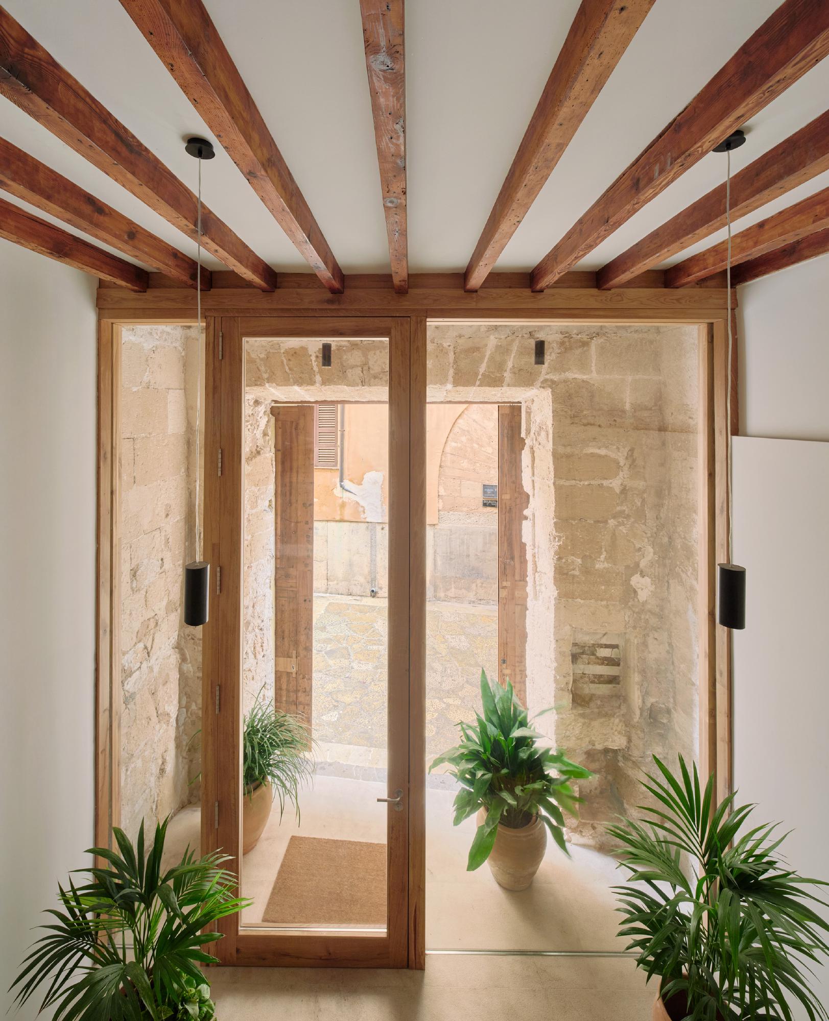
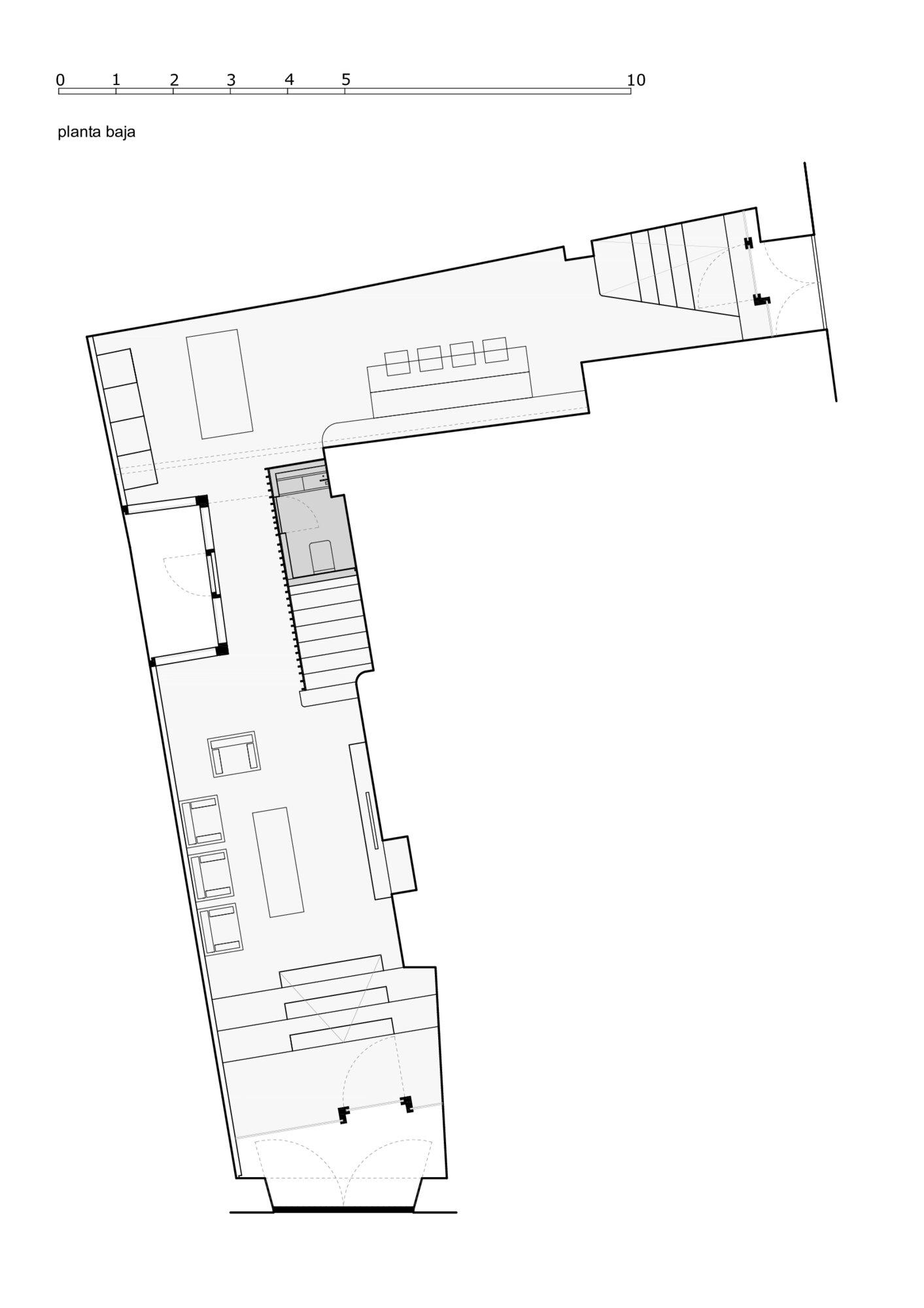
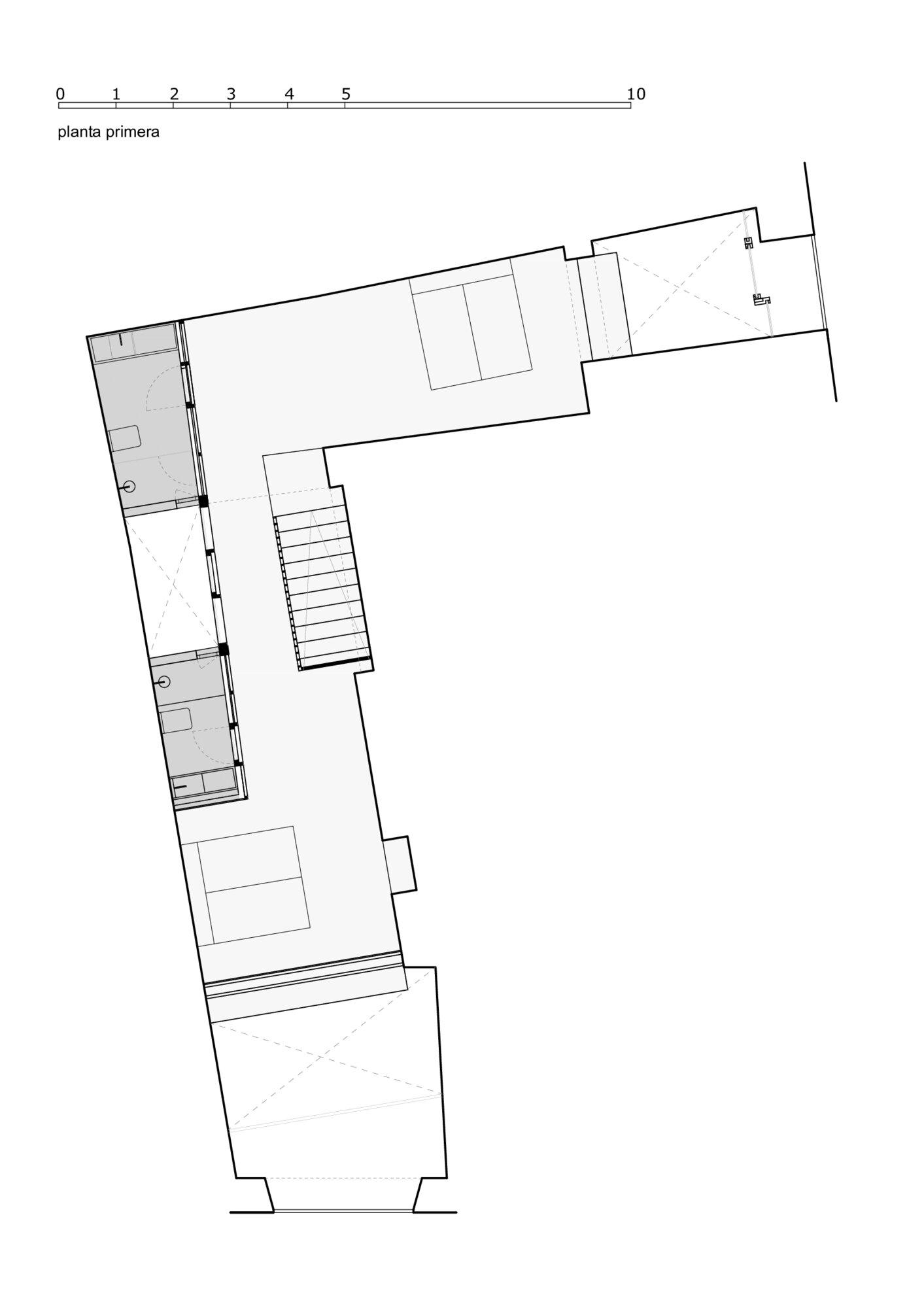
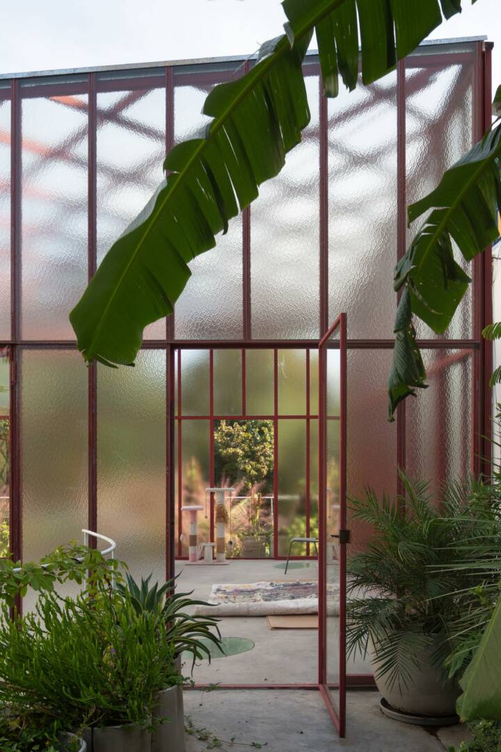
The floor plan forms an L-shape with access from two streets at its ends. Natural light and ventilation are provided through these two ends, although the streets are quite narrow, limiting direct sunlight. Additionally, the building includes a small interior courtyard.
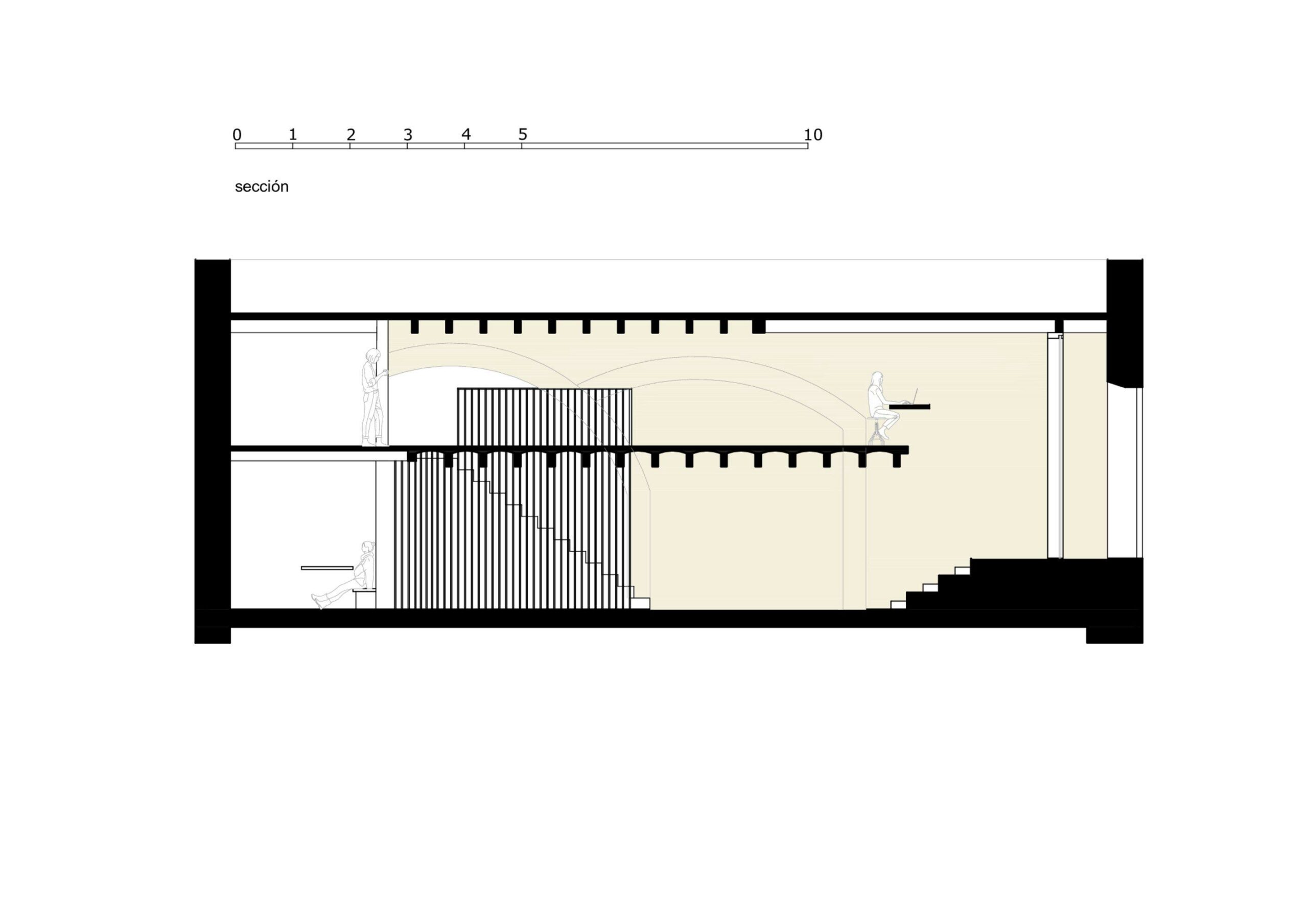
The original space featured a high ceiling and a partial mezzanine, but the overall height was insufficient to comfortably accommodate two floors. During the renovation, the upper part of the building was also being restored. By coordinating efforts, we were able to gain some additional space by lowering the floor slightly, while still preserving the integrity of the building’s foundation.
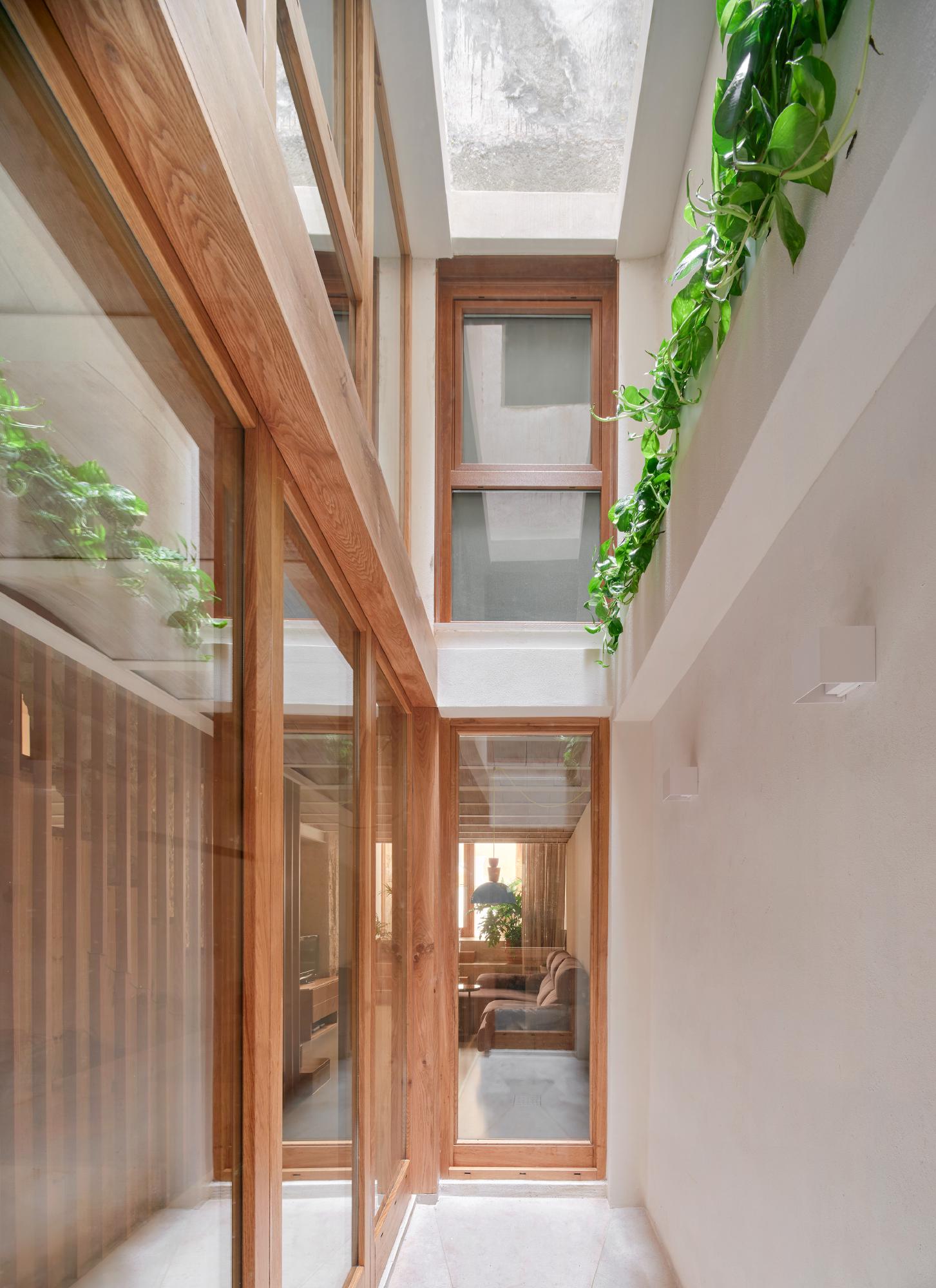
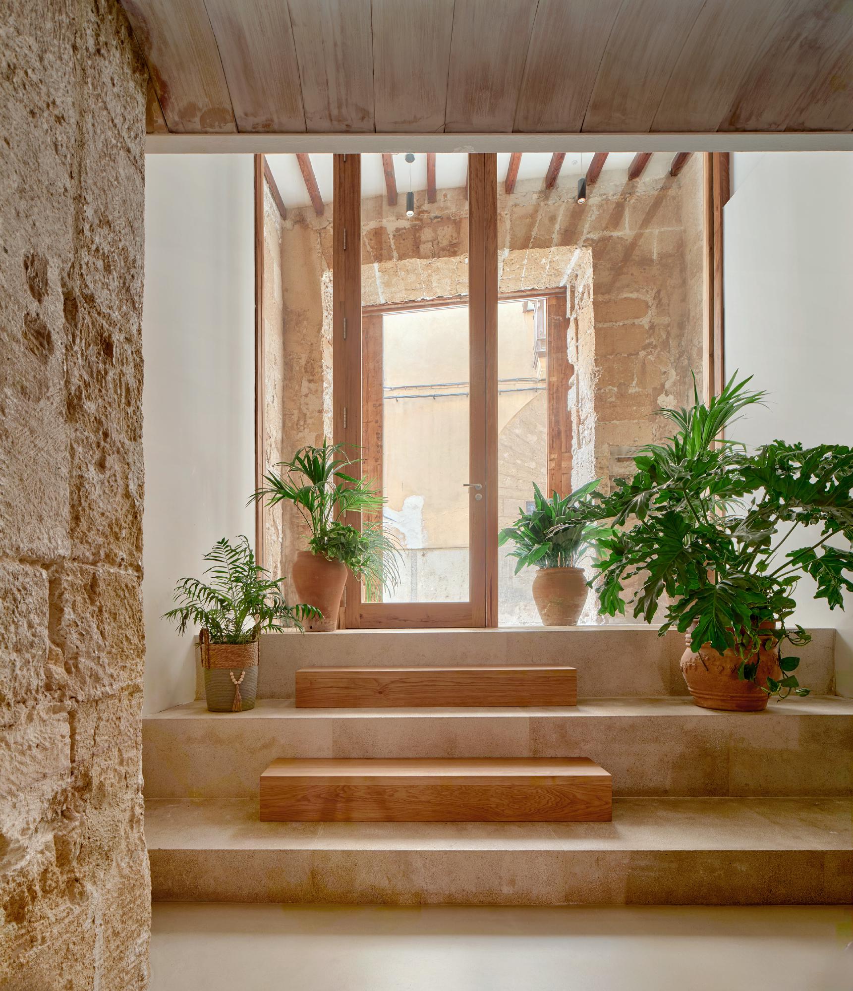
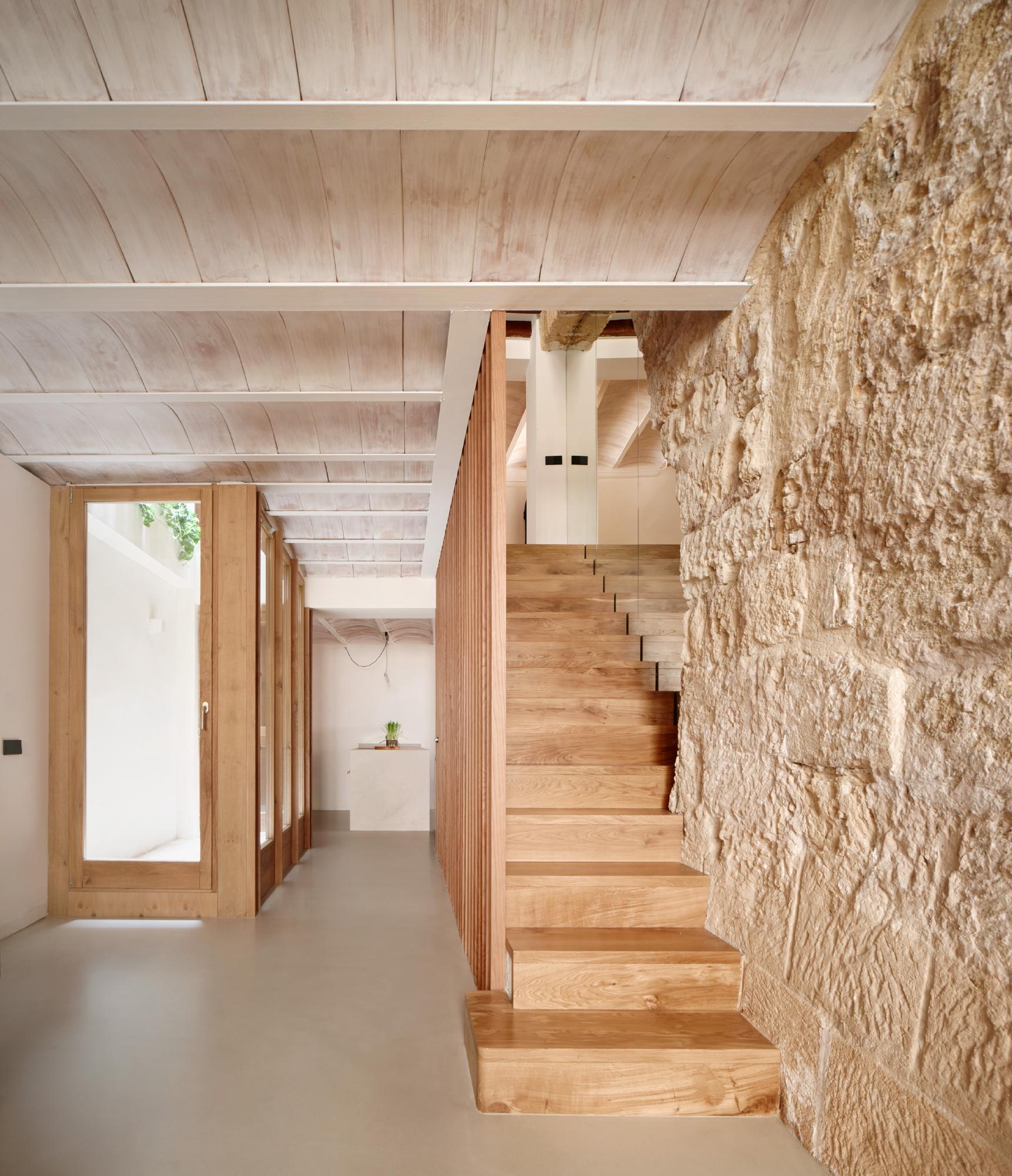
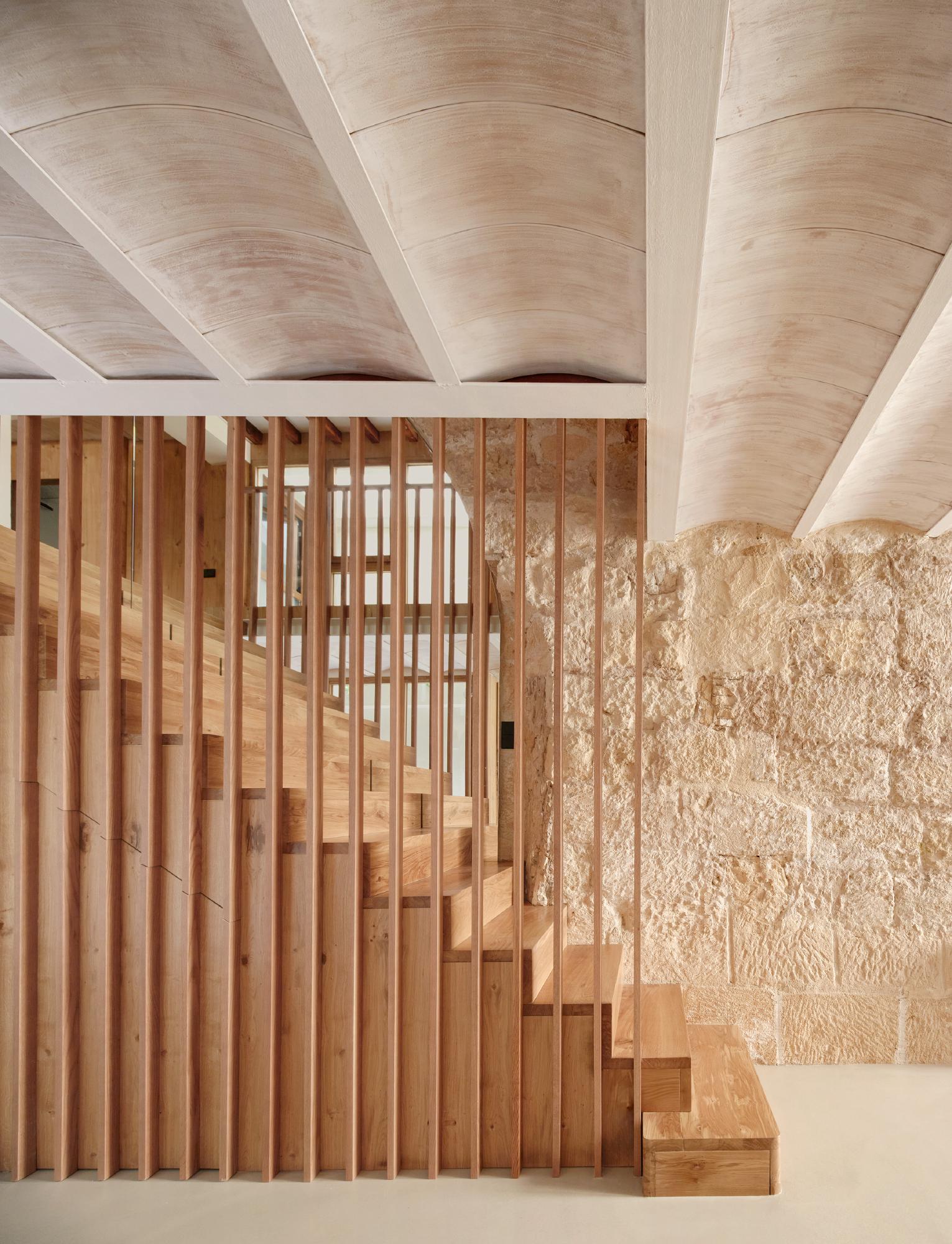
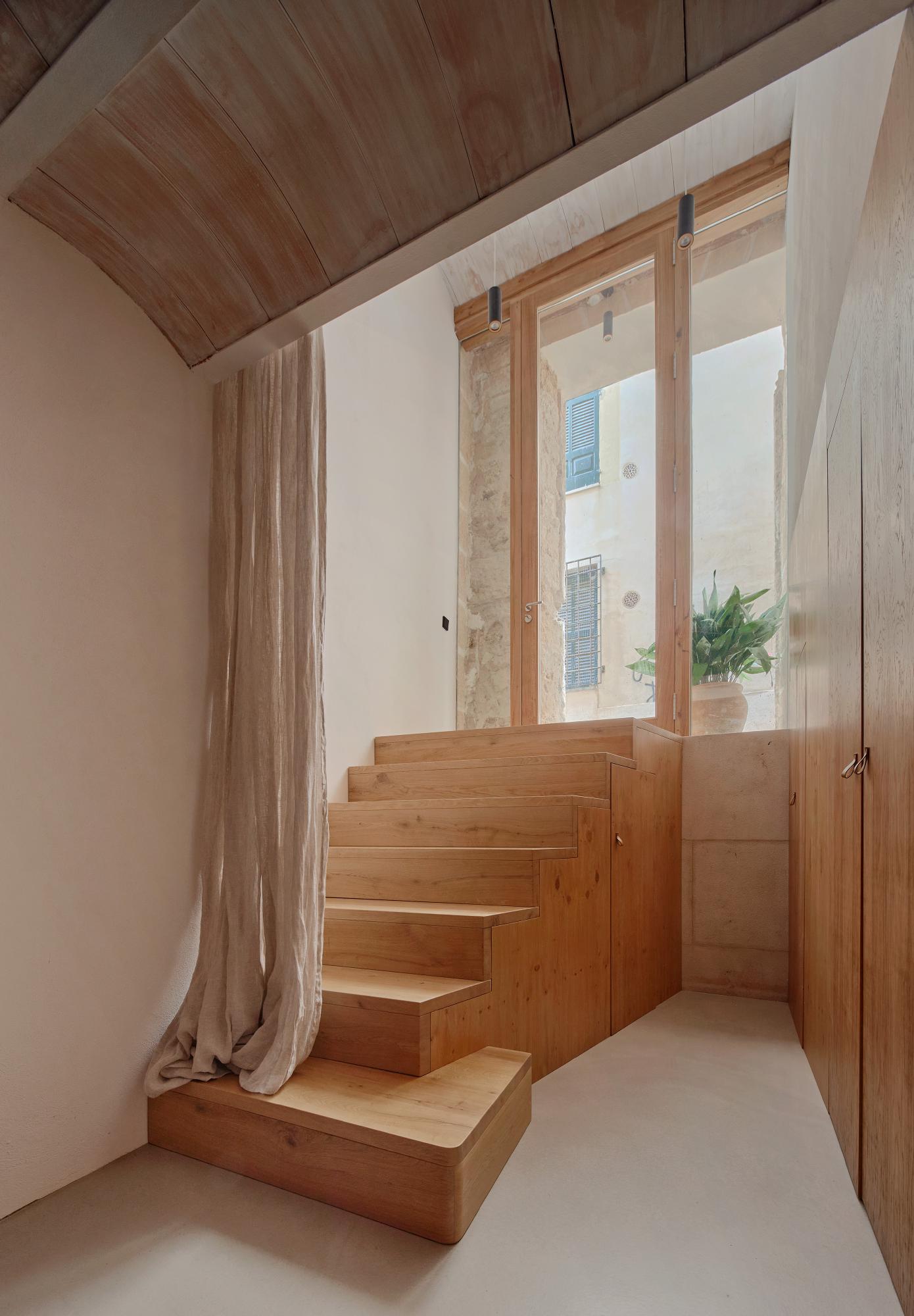
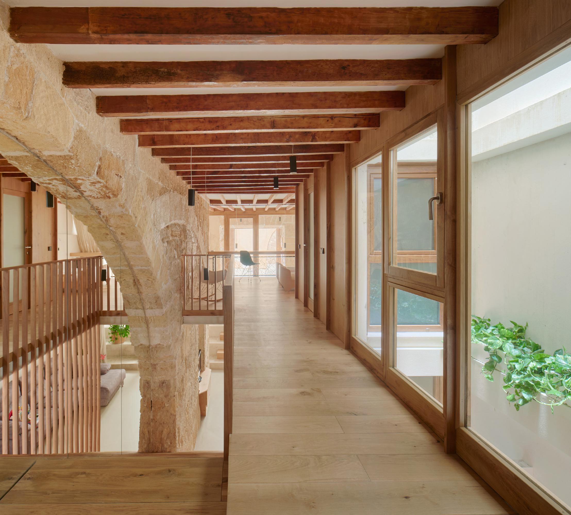
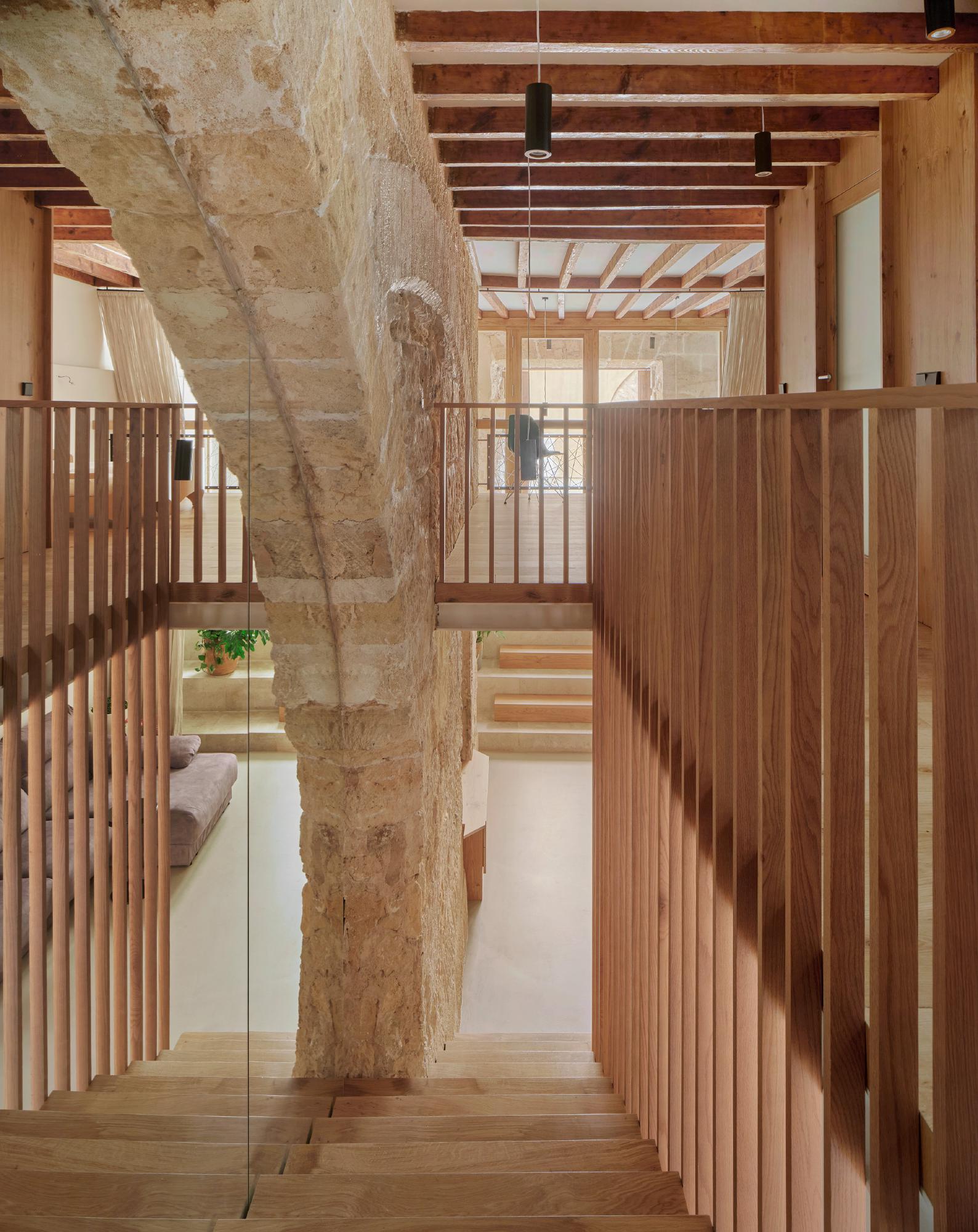
A central staircase connects the main floor with the mezzanine, where we designed two independent bedrooms, each with its own bathroom. The mezzanines were intentionally set back from the façades, allowing natural light from the tall entrances to flood both the ground floor and the upper levels. Additionally, these spaces serve as transitions from the street level down to the main floor.
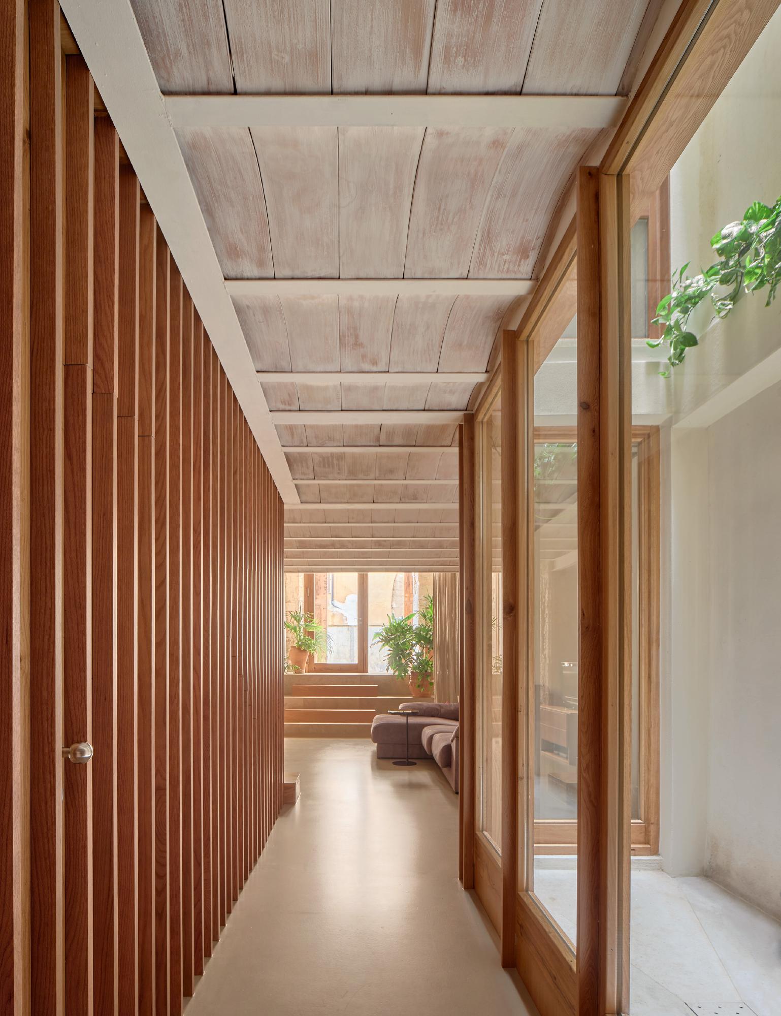
Read MoreThe ground floor features continuous light-colored microcement flooring to maximize the reflection of natural light. This level houses the day-to-day living spaces, including the living room, kitchen, dining area, guest bathroom, and laundry room.
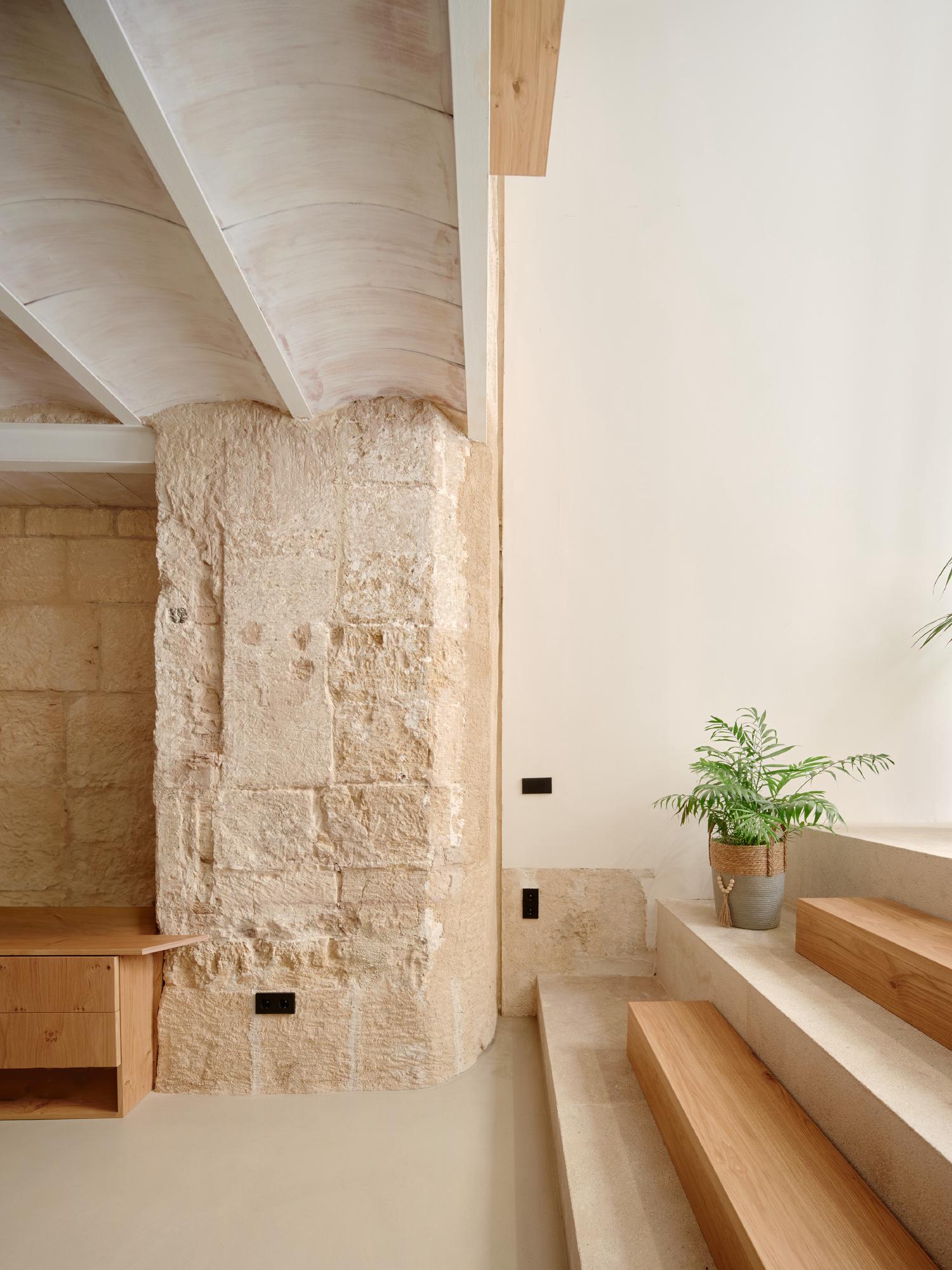
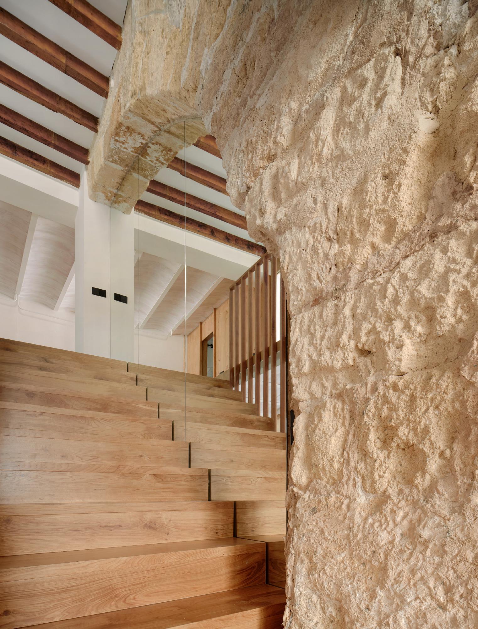
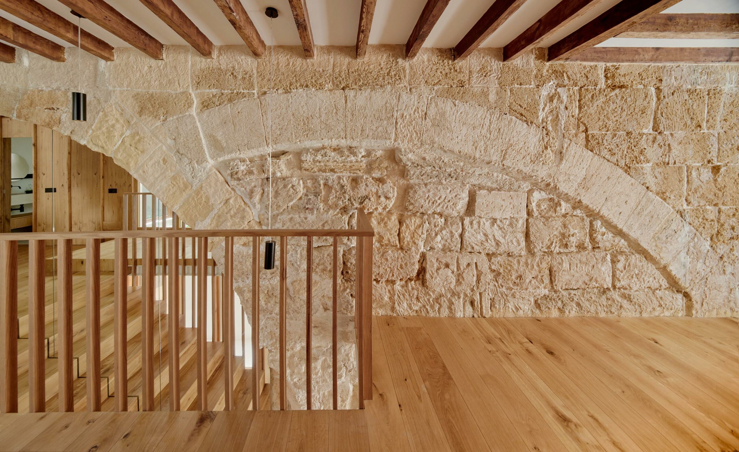
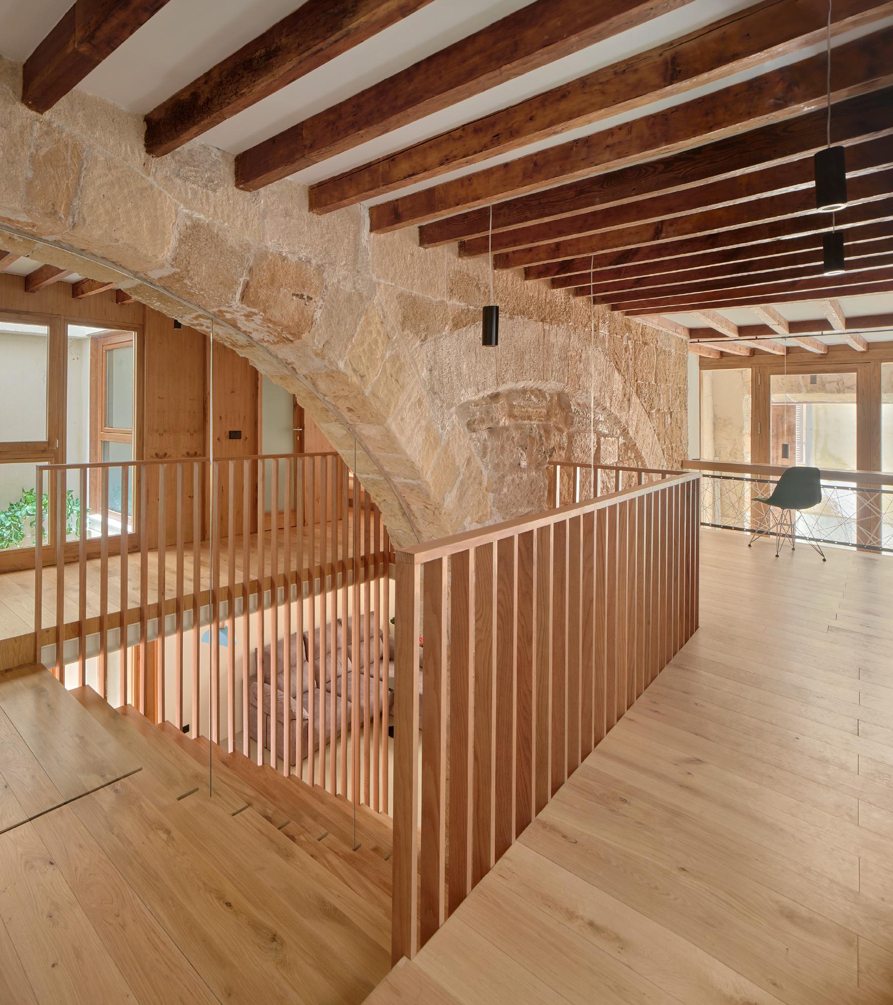
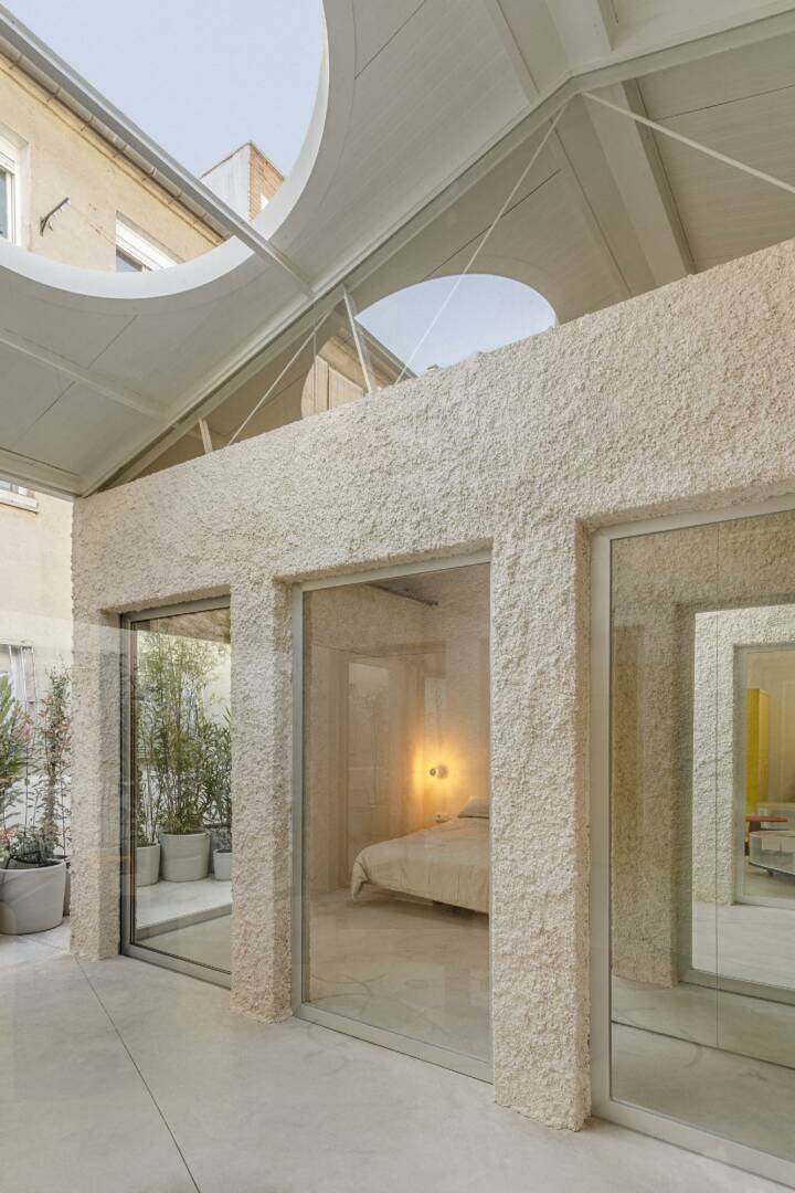
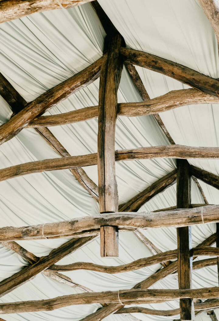
One of the most fascinating aspects of the original building is the historical traces of past constructions, particularly a unique pair of overlapping arches. The design strategy was to preserve and highlight these unique features, as well as the original beams and as many other original elements as possible, presenting them in a raw, unembellished state.
Some walls had to be reinforced due to the crumbling sandstone they were made from, but overall, the goal was to retain the character of the valuable original elements wherever possible.
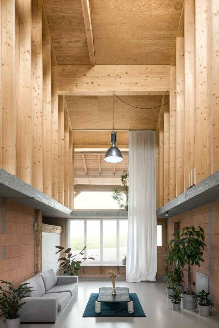
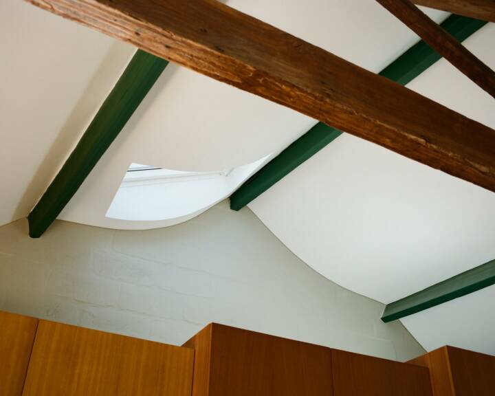
To contrast with the rawness of the original space, oak wood was used for the new architectural elements. This wooden intervention is reversible, clearly identifiable against the original structure, and creates a softer contrast with the otherwise stark environment. The ambiance of the residence was further enhanced with curtains, textiles, plants, and indirect lighting.
In summary, the interior landscape emerges from a deliberate contrast rather than from a generalized neutral comfort. Working with contrasts can be riskier, but when executed with balance, it creates a more exciting result.
This project inevitably draws parallels with the renovation of Can Oliver into the Nobis Hotel, as both involve historical traces and were developed concurrently. At the Nobis Hotel, we used black steel instead of wood to integrate the new program, aiming for an even more extreme contrast between the architecture (which is essential, heavy, powerful, and somewhat rough) and the work of the interior designers, who employed lighter textile elements.
In both buildings, the strategy was akin to surfing, where the approach is more about harnessing existing energies than imposing predefined paths, with contrast serving as the guiding principle.
Text provided by the architect.