Architects: Raúl Sánchez Architects Photography: José Hevia Construction Period: 2022 Location: Barcelona, Spain
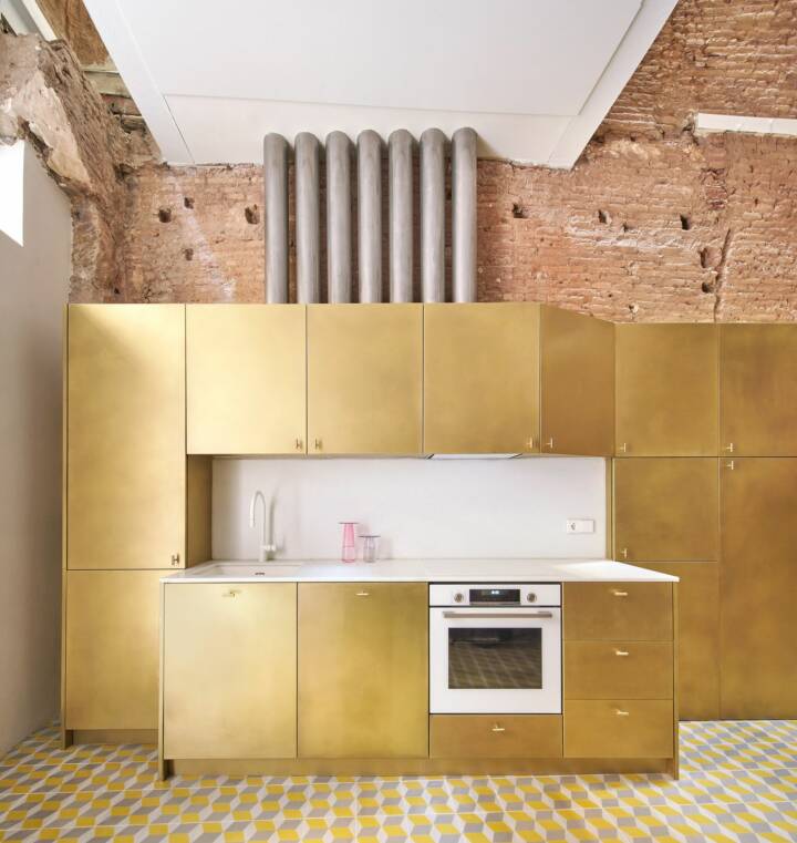
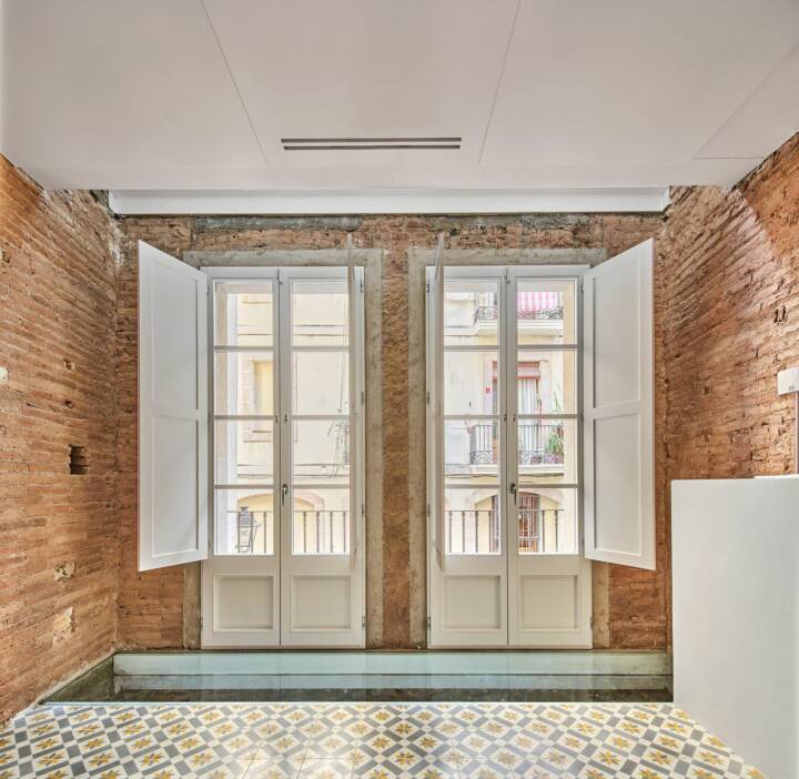
This complex project began 8 years ago, going through all kinds of situations: urban problems, squatters, regulatory disagreements, changes of use, slow and complicated work…although the client’s desire to leave the walls with exposed brick and using hydraulic mosaic (the Barcelona cliché) remains iron and unalterable.
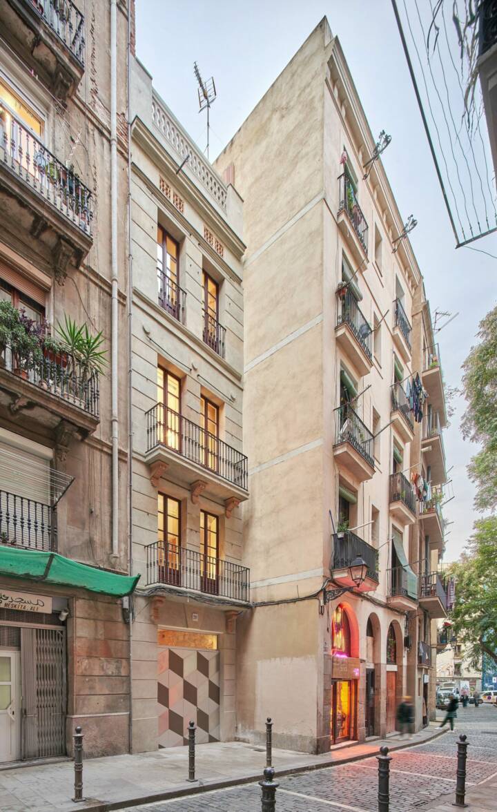
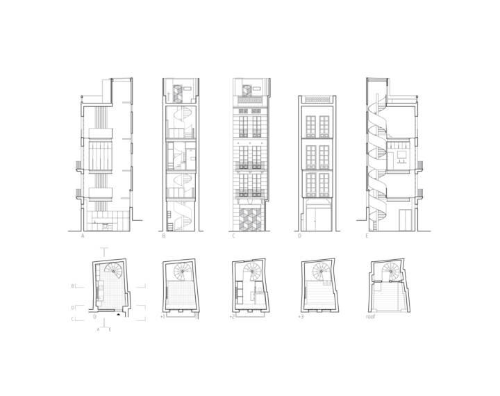
Furthermore, the requirements were to convert this small building located in the Borne neighborhood of Barcelona, from the end of the 19th century and with 4 floors (but only barely 20m2 per floor), into a place where they could work and spend short stays when they came. to Barcelona, although, during these 8 years, the client’s personal and family situation has changed, to which the project has adapted.
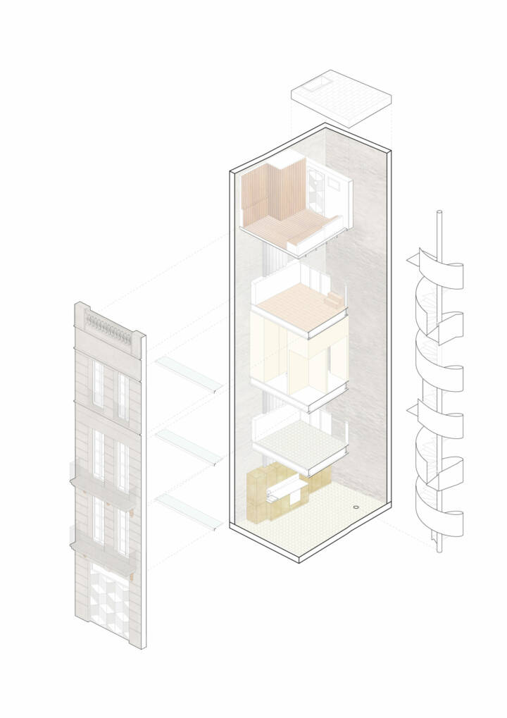
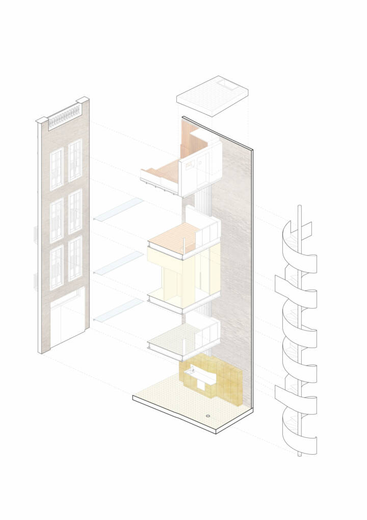
The original situation of the property was a ruin, with floors with a very damaged structure and narrow, weak stairs, and in sections collapsed. Added to this was the need to adapt the building to current regulations, which practically made it impossible from the beginning to reuse the interior, proceeding to completely demolish the building, keeping only the facades and party walls, and the roof slab (which is not the stair tower, which was redone).
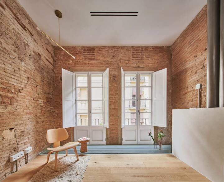
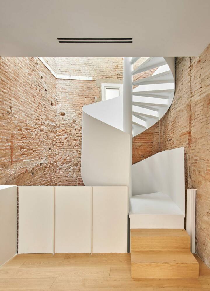
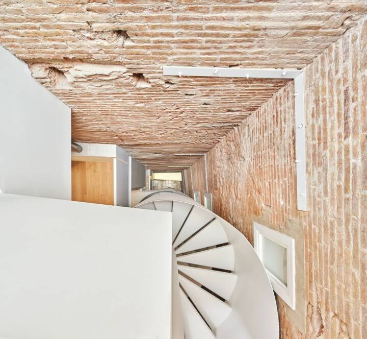
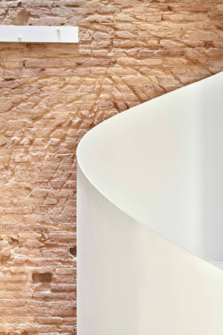
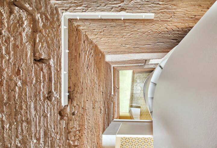
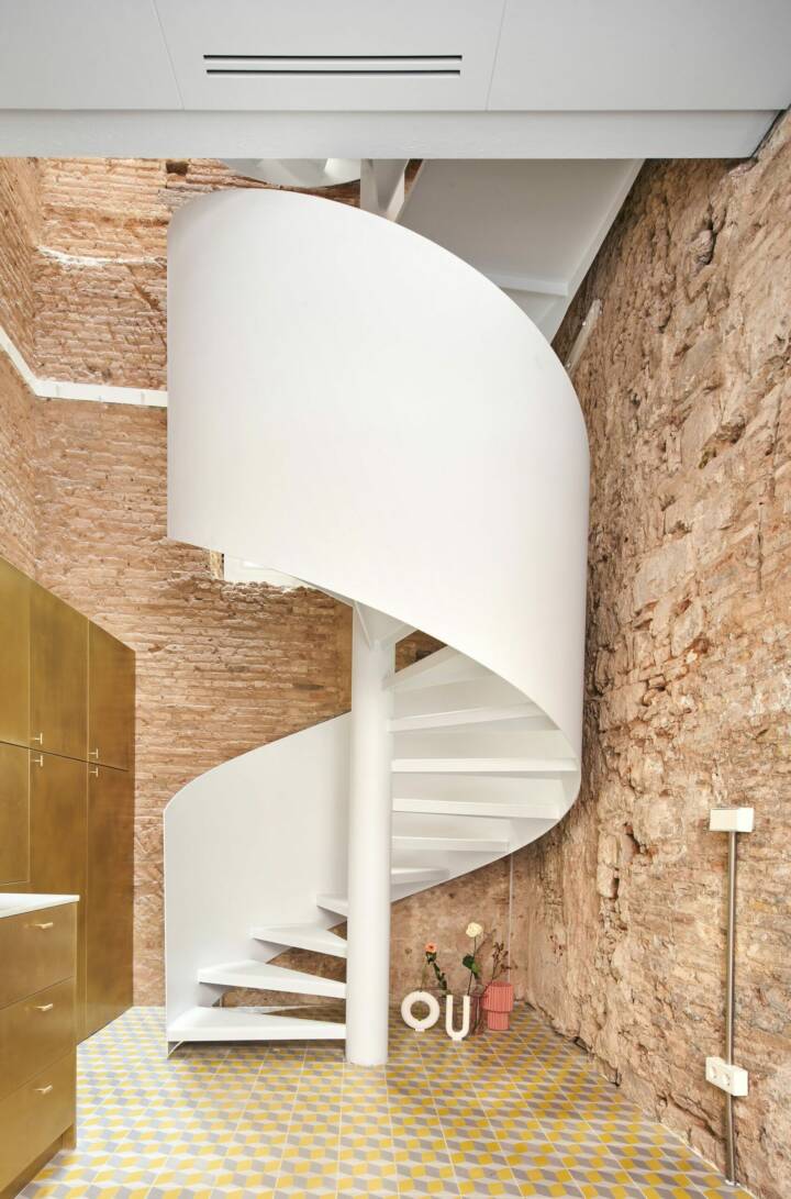
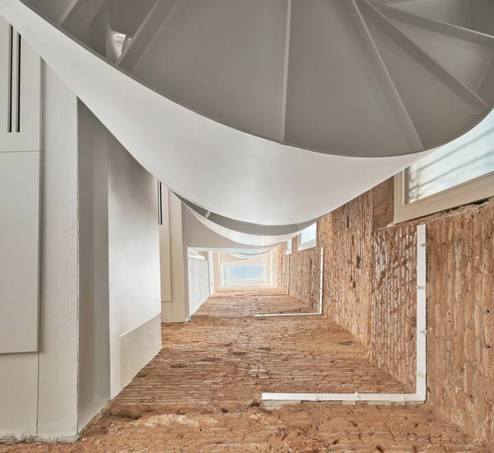
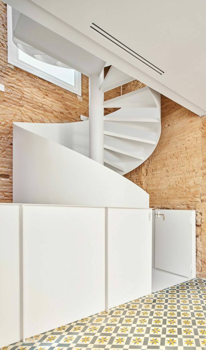
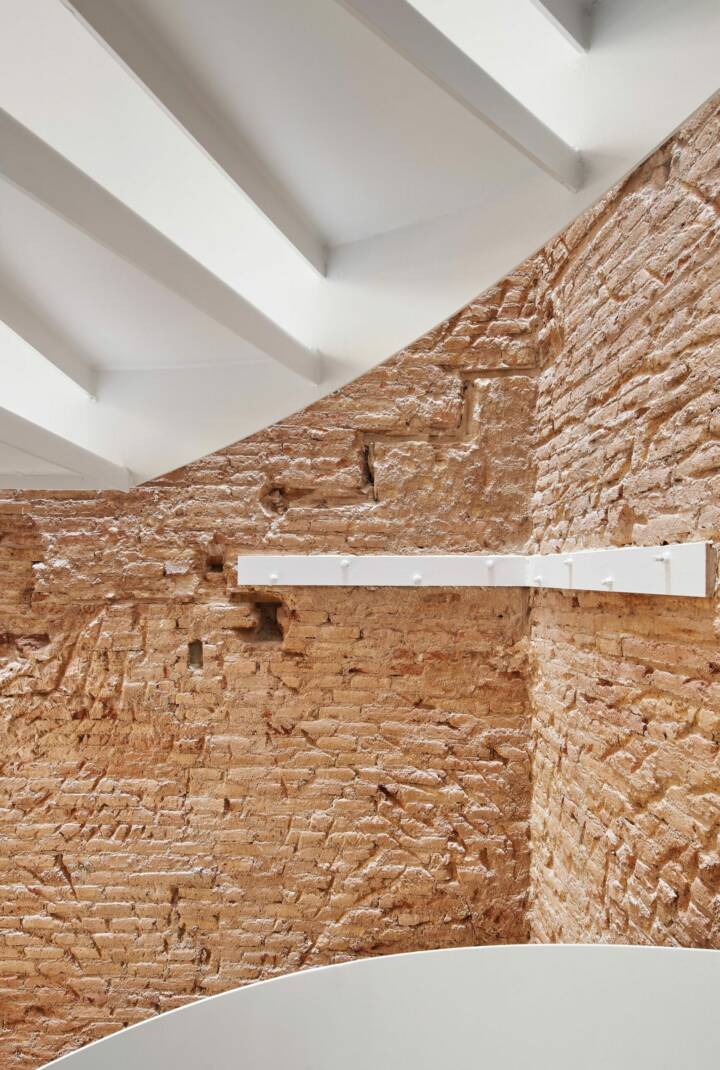
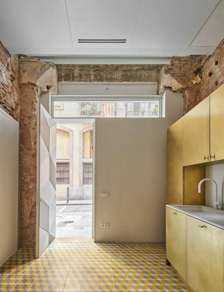
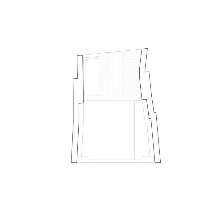
Read MoreCloseThe construction process, slow and complex, at least allowed decisions to be made as the essence of the property was revealed with the demolitions. Thus, once all the slabs had been demolished and the building was seen as a slender and tall prism formed by walls with a completely heterogeneous composition of all types of bricks and stones arranged without apparent order or composition, the idea of leaving all these walls seen became conceptual: these four walls, more than 15m high, are a museum of the history of the building, where any trace of construction (arches, lintels, gaps in the steps and beams), and use (remnants of mortars) , furniture, subframes or coverings) will be left unaltered, exposed in all its rawness.
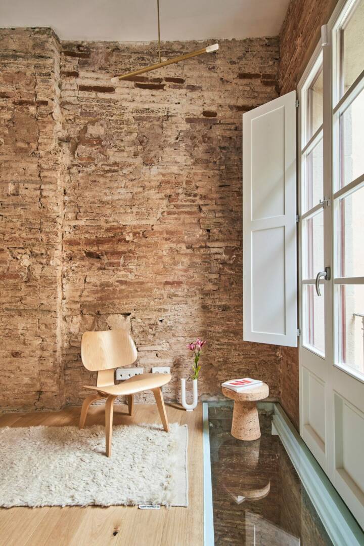
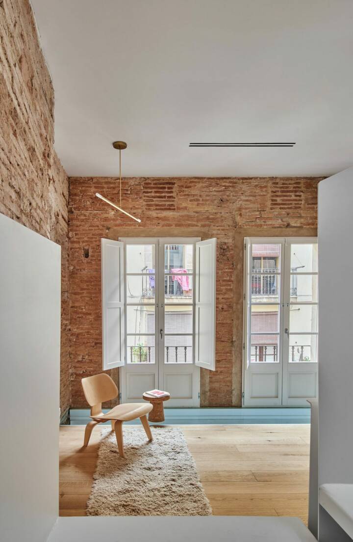
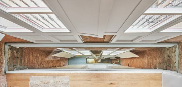
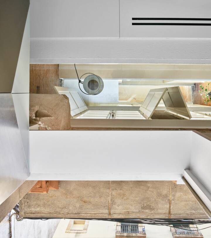
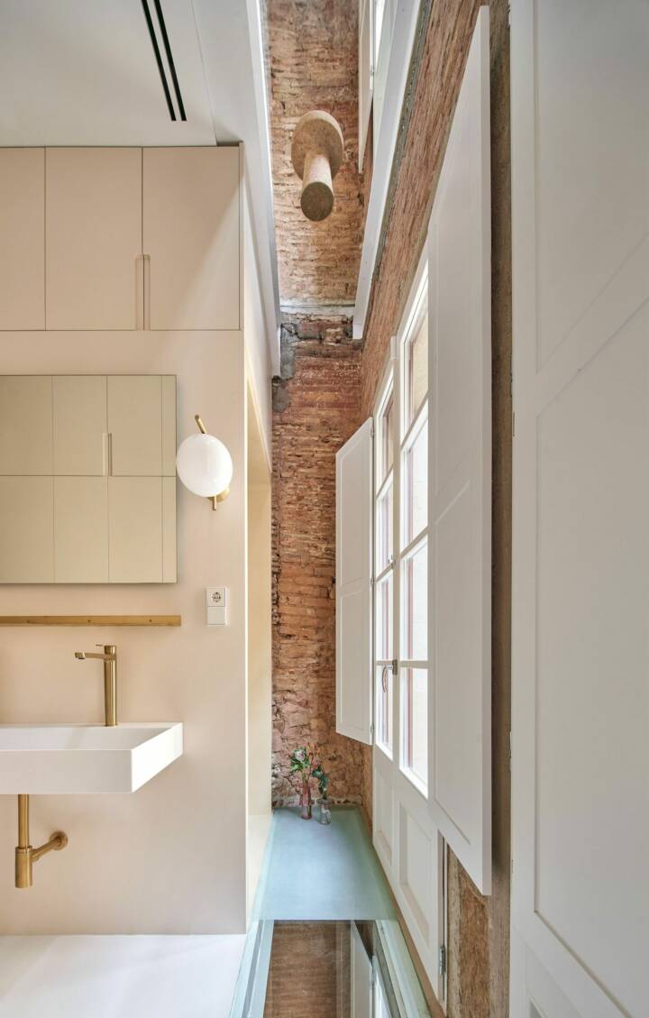
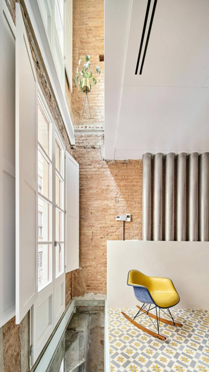
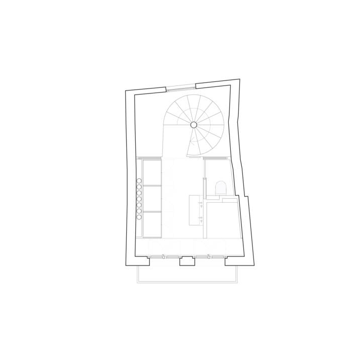
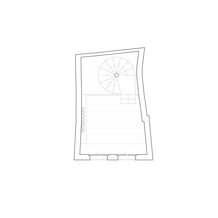
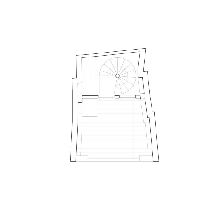
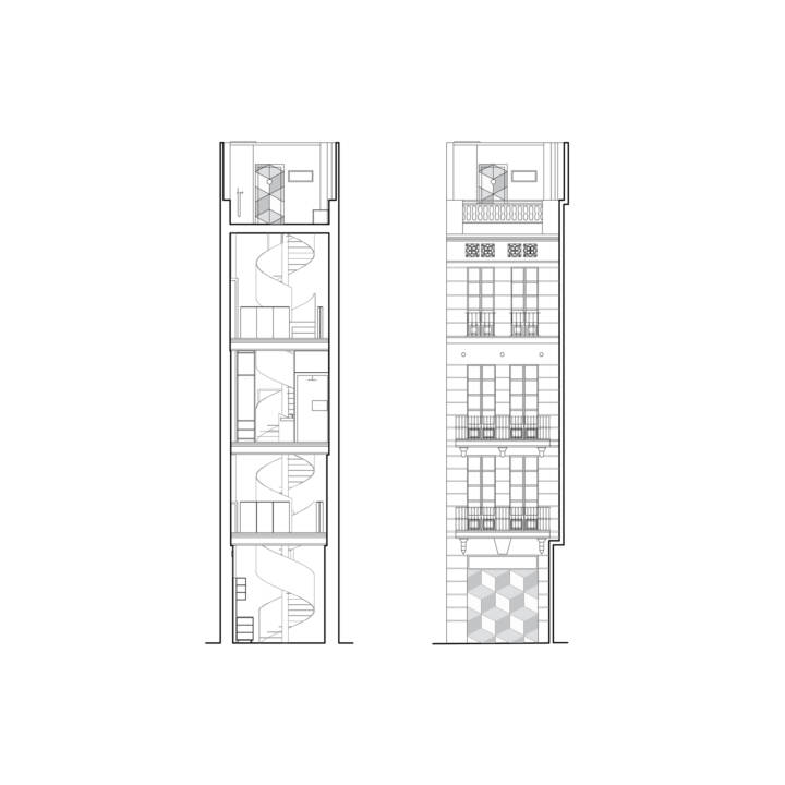
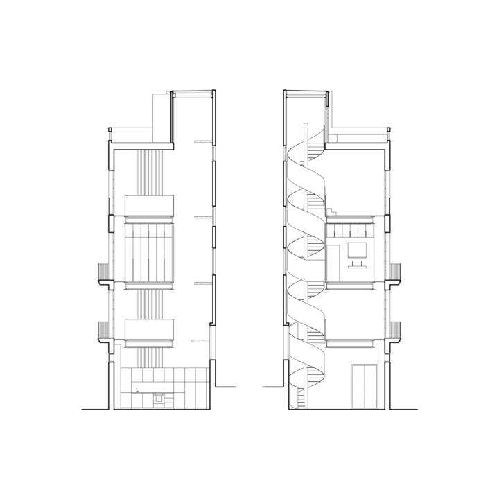
The new slabs (3 in total) will be sheets held by new beams between the party walls, which will not touch either of the two facades: towards the main facade, a sheet of glass will separate them from it; and towards the interior façade, the stairwell will be a 4-storey void that unites the entire interior and shows the surprising height of such a slender building.
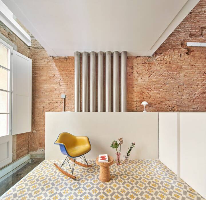
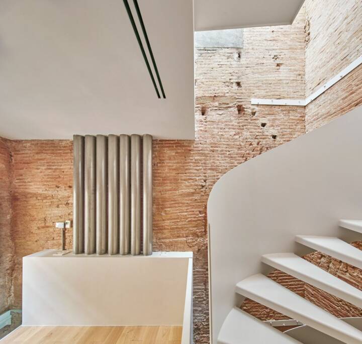
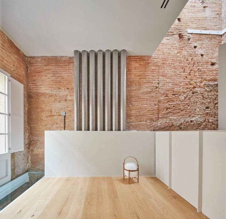
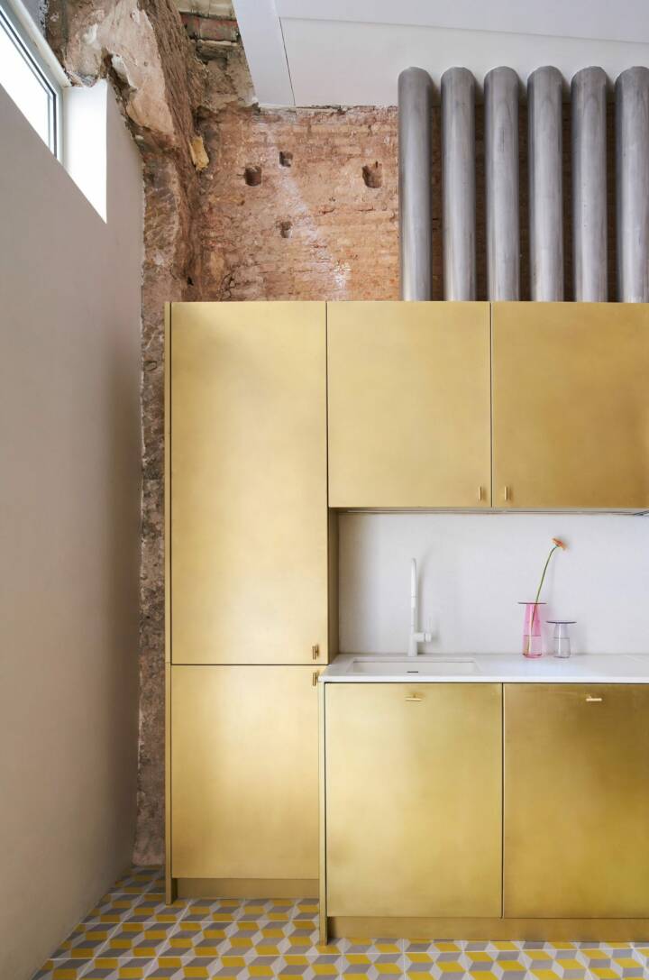
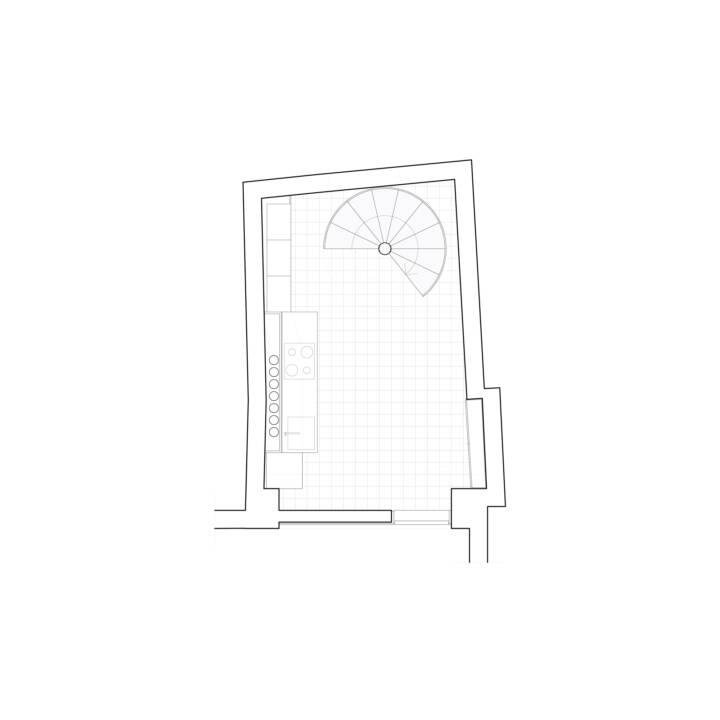
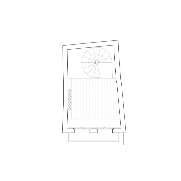
The steps of the facilities, by ruling out from the beginning regattas on the walls or small skateboards, take on a special and relevant role in the interior: 7 stainless steel cylinders run the entire height of the building carrying all the electrical installations inside, ventilation, plumbing, extraction, sanitation, air conditioning and telecommunications in 6 of the cylinders, leaving one space for future needs.
These cylinders are not hidden and travel through the building, passing through furniture and flooring. The rest of the installations are always visible, never built-in, highlighting the roughness of the masonry walls on which they are located, freeing them from new constraints.
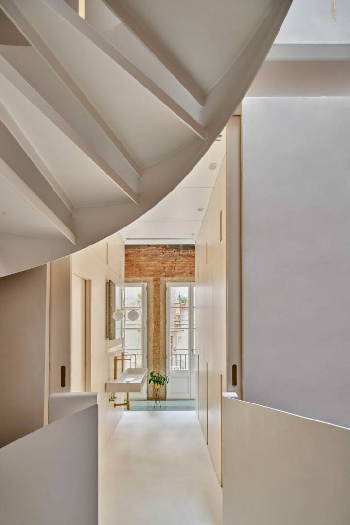
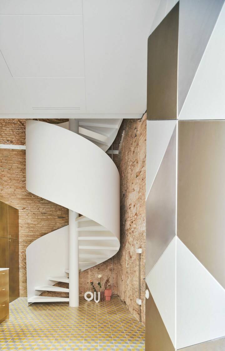
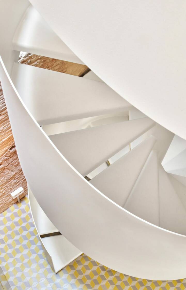
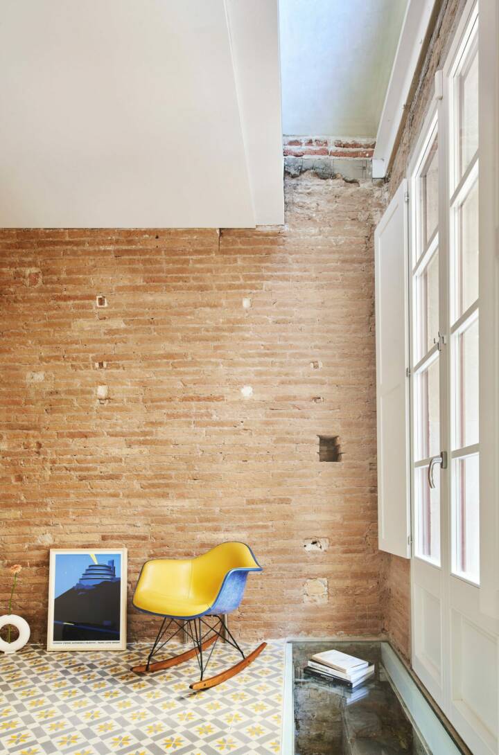
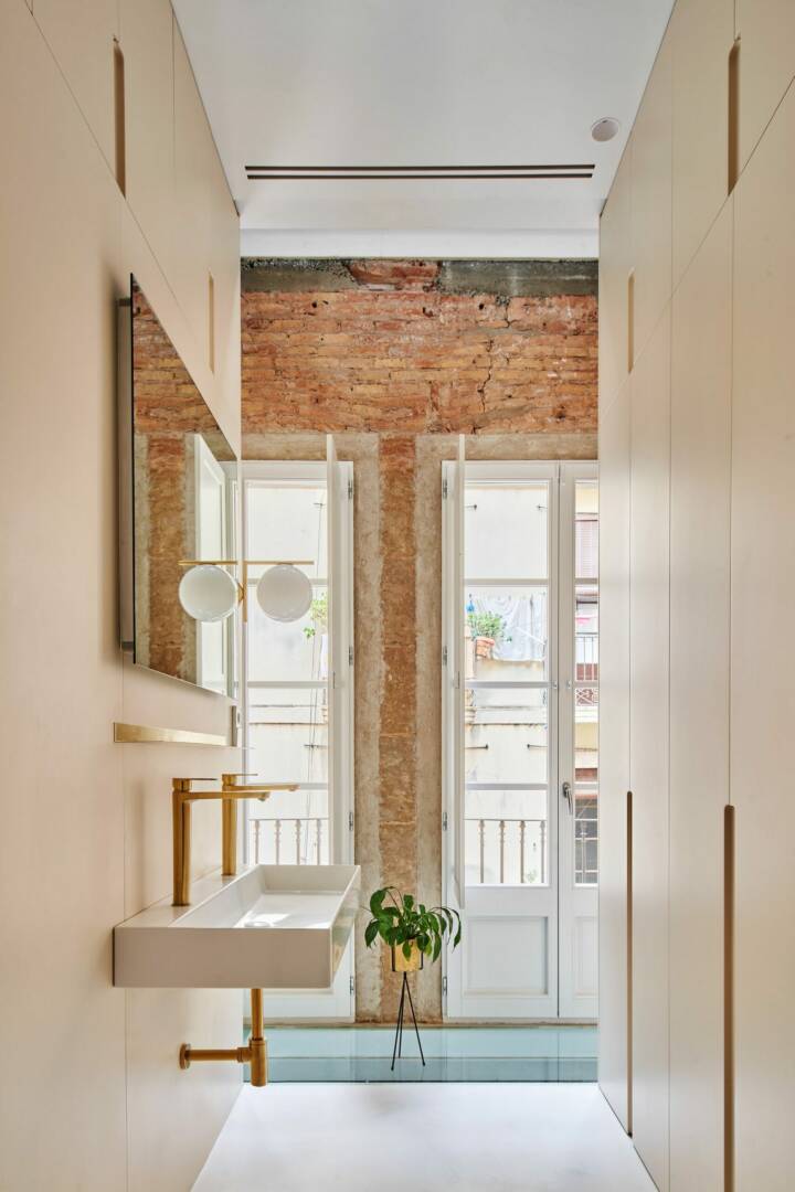
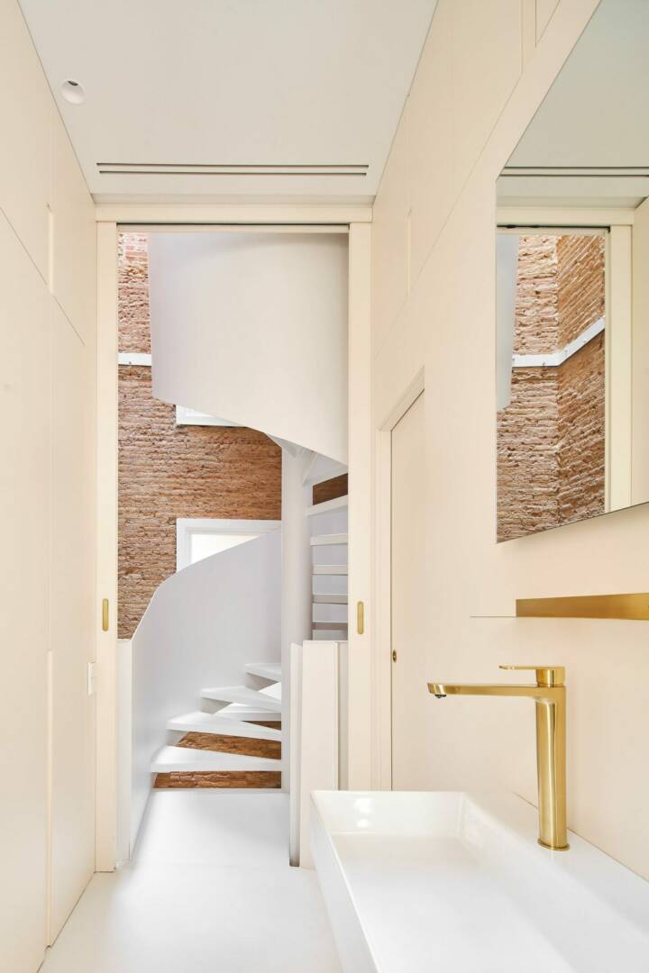
Materially, a certain refinement has been pursued in the new elements to be implemented, in opposition to the crude expressiveness of the existing walls, aware that the space must house a home. Thus, the kitchen is a piece of frosted brass furniture, shiny and reflective, with a white marble top; The bathroom equipment is paneled with lacquered wood in a slightly cream color, with black and brass details; the ‘headers’ of the plants are covered in white microcement; The hydraulic mosaic, microcement and oak floors add warmth and color to the interior; and the white lacquered wood ceilings incorporate registers and grilles to ‘design’ these needs.
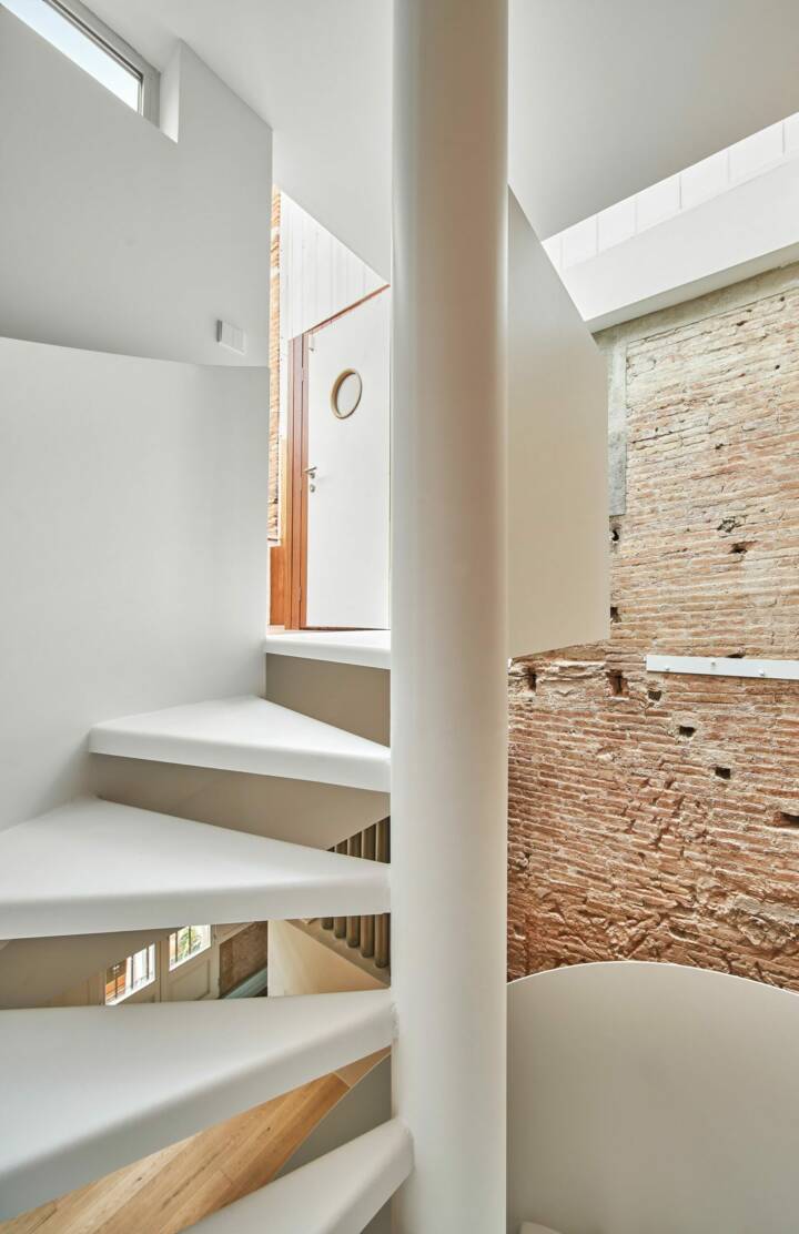
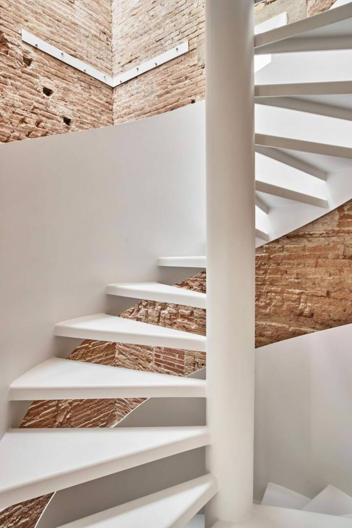
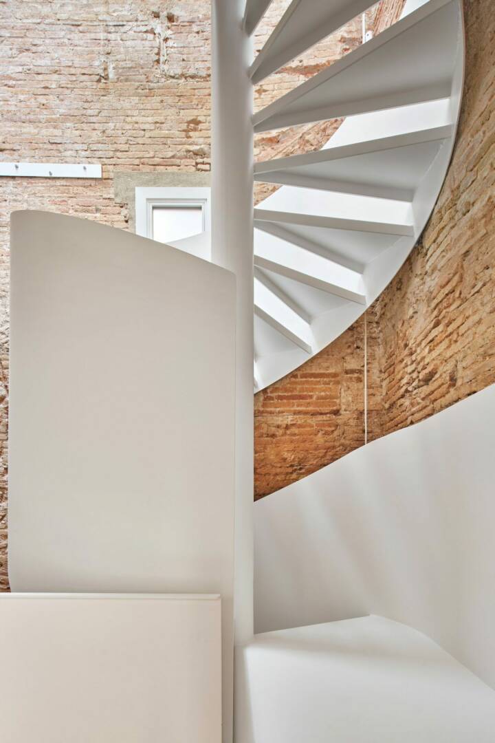
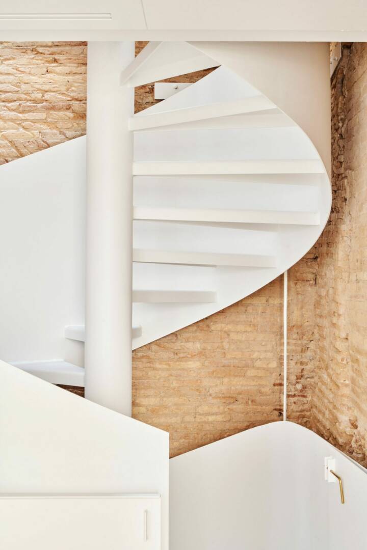
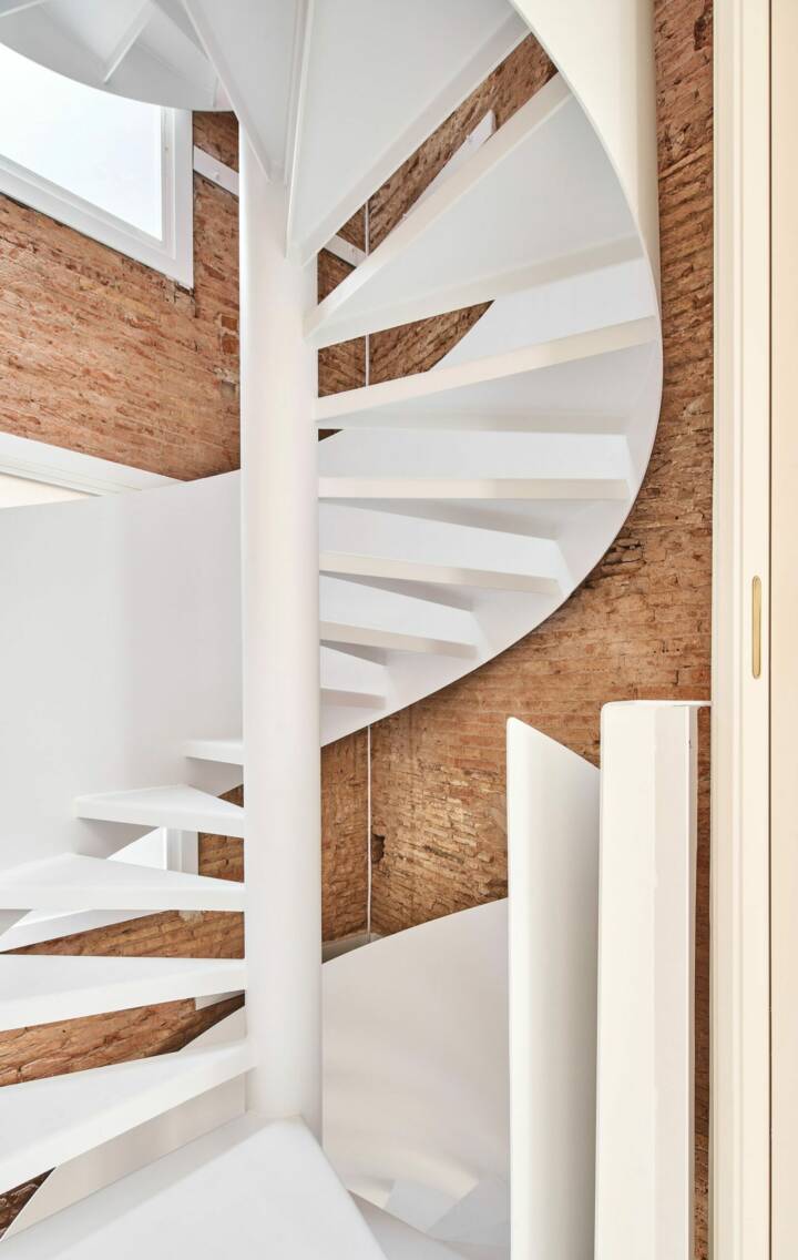
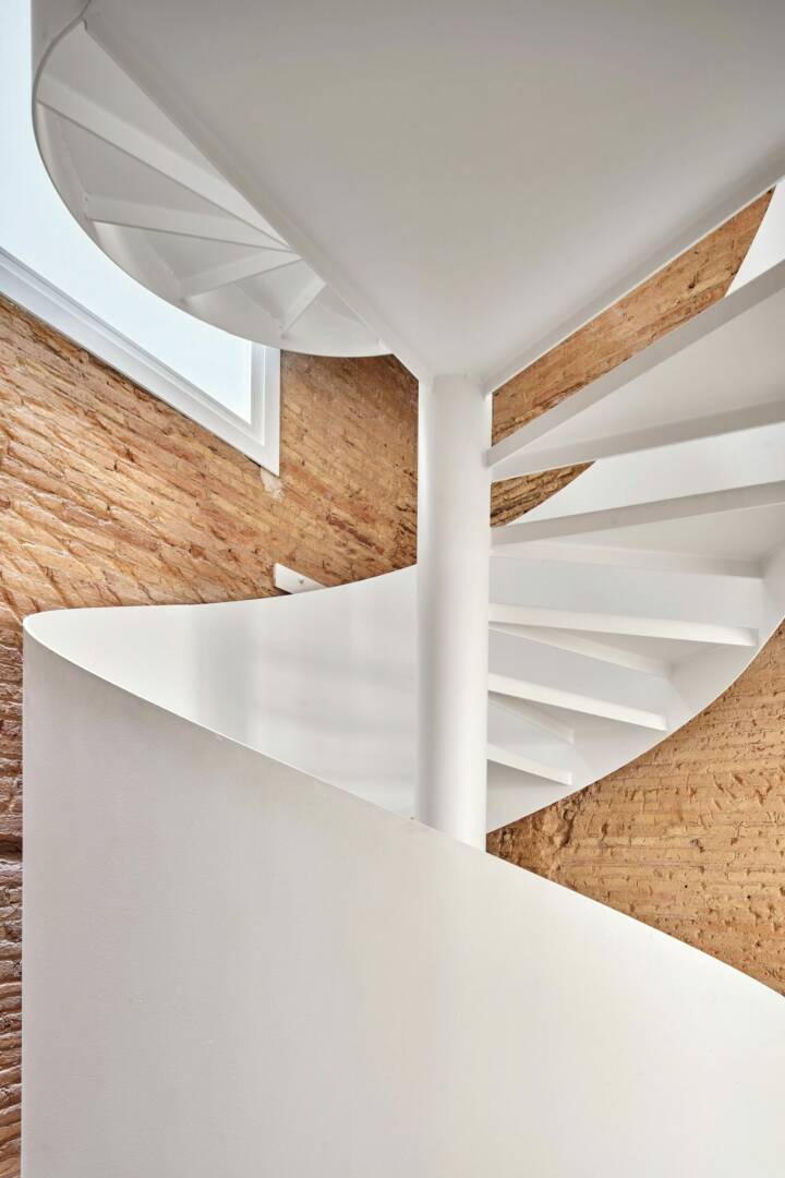
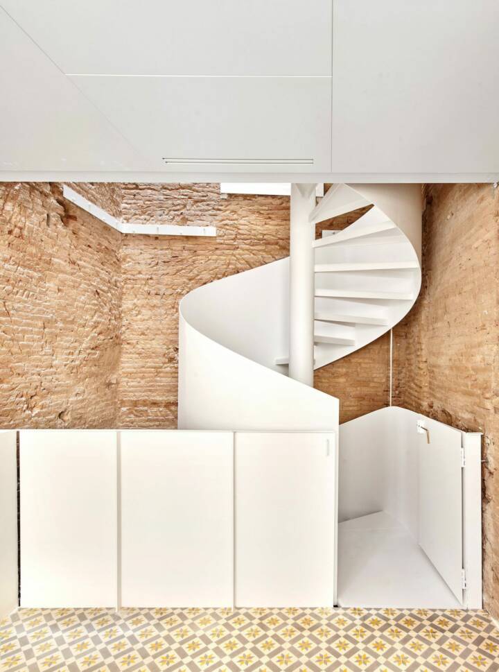
The structure is all painted white, wanting to seek a certain material abstraction, especially in the development of the staircase, with a helical layout, which develops as a free-standing cylinder that runs the entire height of the building without ever touching its walls, offering Piranesian views helped by the heterogeneity of the walls and the diversity of the points of view. On the contrary, all the details on the existing walls are direct and raw: the window frames are made with direct mortar, the pre-frames are not disguised, and the structural tying elements are left unpolished.
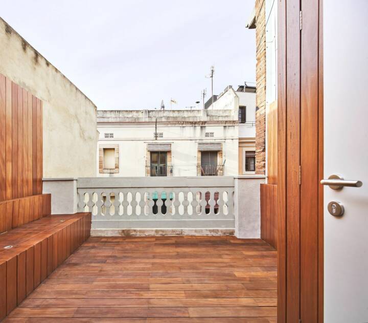
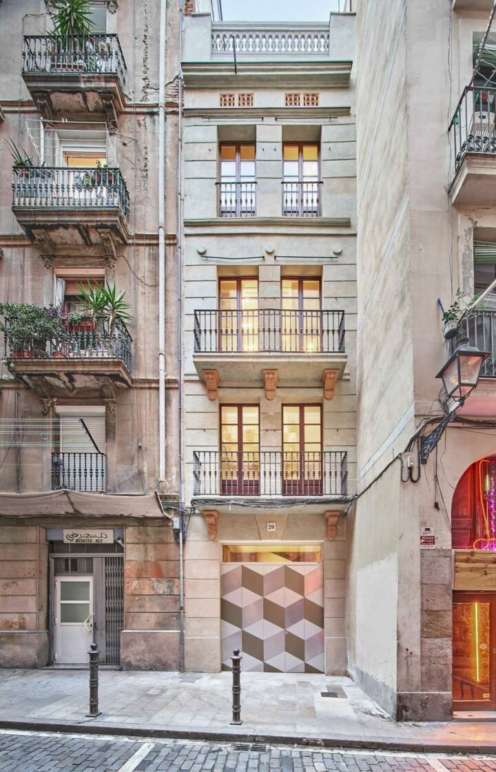
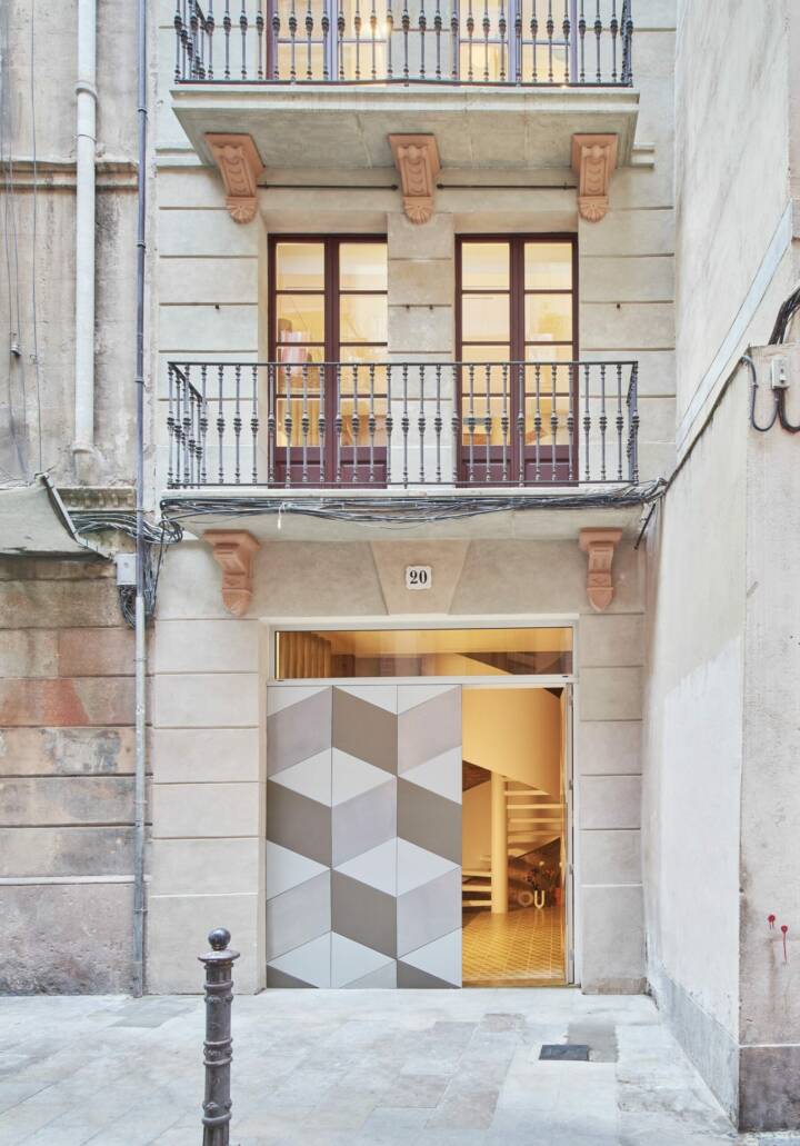
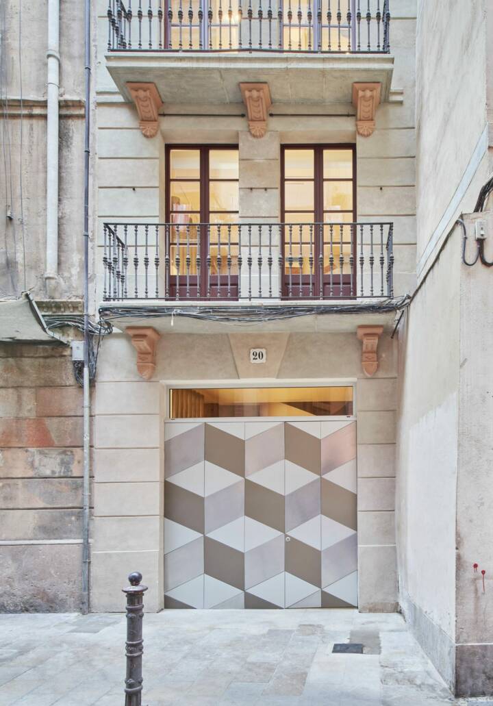
Above, in the tower’s forging, a skylight introduces a beautiful gradation of light to the lowest strata; Towards the façade, the glass sheets bounce the lighting between floors and introduce ever-changing reflections, allowing the façade to be admired in all its height from the inside, just as happens in the void of the staircase. The main façade was rehabilitated following the strict dictates of the heritage department, returning it to an image of the past that it surely never had.
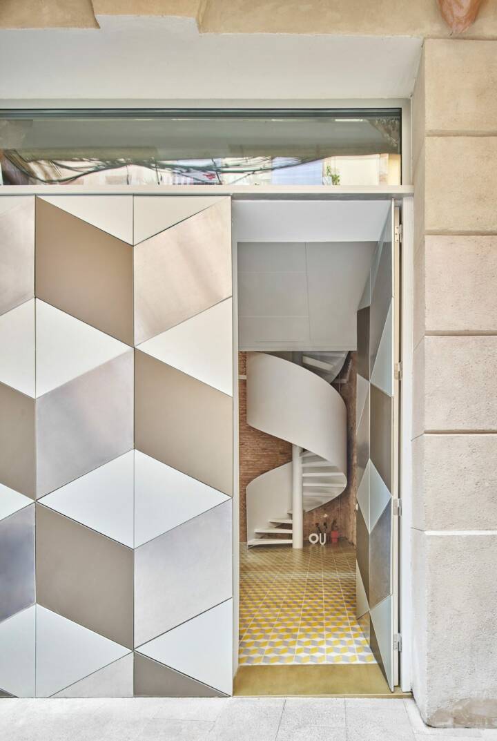
Only at the entrance door were we free to invent a front that reproduces the three-dimensional design of the classic hydraulic mosaic (used on the ground floor and very loved by the client) with a layout of rhombuses and triangles finished with 3 types of aluminum, which conceals the door (only recognizable by the lock) and abstracts the entrance.
Text provided by the architect.
